Home
PQWT
Security Sensors
PQWT-S500
PQWT PQWT-S500 User Manual
5
of 1
of 1 rating
35 pages
Give review
Manual
Specs
To Next Page
To Next Page
To Previous Page
To Previous Page
Loading...
32
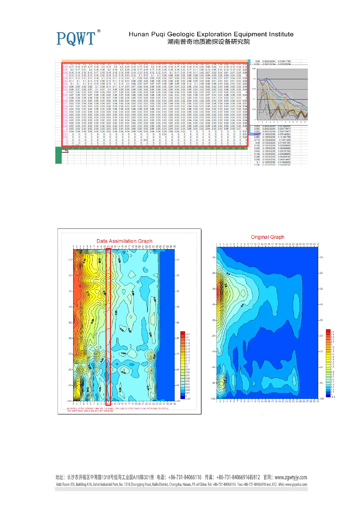
Figur
e 10
9.
A
fter
processed
the
data,
then
we
can
make
the
graph
according
to
the
method
N
o.
2
above,
here
is
the
contrast
between
Data
Assimilat
ion
and
C
ontour
Map
(It
’
s
the
graph
according
to
the
original dat
a) in figure 1
1, the point
11
is recomm
ended.
Figur
e 1
1
Here, the Data
Assimilation g
raph is finished.
31
33
Table of Contents
Default Chapter
1
Table of Contents
1
Foreword
2
Caution
2
Product Overview
2
Advantages
3
Technical Parameters
4
Instrument Structure and Name
5
Pqwt-S150
5
Pqwt-S400
5
Pqwt-S500
6
Instrument Host Panel
6
The Use of the Instrument
7
Instrument Works Introduction
7
Main Screen Description
7
M N Electrode Description
11
Wiring Method
12
Data Transmission and Data Format
12
Instrument Drawing Methods
14
Case Show
33
Advised Measurement Approach
34
Configuration Table
35
Guide for After-Sale Services
35
Statement
35
5
Based on 1 rating
Ask a question
Give review
Questions and Answers:
Need help?
Do you have a question about the PQWT PQWT-S500 and is the answer not in the manual?
Ask a question
PQWT PQWT-S500 Specifications
General
Brand
PQWT
Model
PQWT-S500
Category
Security Sensors
Language
English
Related product manuals
PQWT PQWT-S Series
35 pages
 Loading...