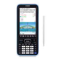
Statistics Menu
Tap the chart and drag to Cell B1 to display the
relative frequencies, shown as percents. (tap-and-
drag is similar to click-and-drag with a mouse.)
2. Construct a bar chart for these data.
Select Column A again. Tap the # near the upper-
right corner to access the graph drop down menu.
Then tap H to construct a bar chart.
Getting Started with the Classpad II
33