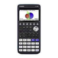
Statistics Menu
Plots and statistics for quantitative data can be created in either the spreadsheet or statistics
menu. The statistics menu will be used for this example.
The number of games won (out of 162) by a certain baseball team for the years 2002 – 2013
are shown in the table.
67 88 89 79 66 85
97 83 75 71 61 66
1. Construct a histogram for these data.
Tap
m, then the Statistics icon. Enter the frequen-
cies in list1. Press
E to move to the next value.
Tap
G to setup the plot. Select On, and use the
drop down menus to select Histogram, list1, and 1
as shown. Then tap Set.
Getting Started with the Classpad II
35
