Do you have a question about the LEGRAND Netatmo and is the answer not in the manual?
The outdoor Air Quality Health Index (AQHI) is displayed on the outdoor dashboard.
This color code scale makes it easier to understand air pollution at a glance.
The AQHI is divided into four categories: Low, Moderate, High, and Very High.
European CITEAIR air pollution indices are shown on the outdoor control panel.
Touching the air quality indicator button allows switching between background and traffic pollution.
This color code facilitates a quick understanding of the air pollution level.
These indices have 5 levels from 0 (very low) to >100 (very high) and are a relative measure.
The European CITEAIR air pollution index is displayed on the outdoor control panel.
Touching the air quality indicator button allows displaying complementary information.
This color code makes it easier to understand air pollution at a glance.
These indices have 5 levels from 0 (very low) to >100 (very high) and are a relative measure.
The outdoor Australian Air Quality index AQI is displayed on the outdoor dashboard.
Touching the '...' button in the air quality gauge displays complementary information.
This color code scale makes it easier to understand air quality at a glance.
The outdoor Air Quality Index AQI is displayed on the outdoor dashboard.
Touching the '...' button in the air quality gauge displays complementary information.
This color code scale makes it easier to understand quickly whether air pollution is reaching unhealthy levels.
The AQI is divided into six categories: Good, Moderate, Unhealthy for Sensitive Groups, Unhealthy, Very Unhealthy, Hazardous.
By touching the '...' button in the air quality gauge, you can display complementary information.
The Air Pollution Index is divided into seven categories: Excellent, Good, Slightly polluted, Lightly polluted, Moderately polluted, Heavily polluted, Severely polluted.
The Outdoor Air Pollution Index (API) is displayed on the outdoor dashboard.
Touching the '...' button in the air quality gauge displays complementary information.
This color code scale makes it easier to understand quickly whether the air is polluted.
The Air Pollution Index is divided into seven categories: Low, Medium, High, Very High, Severe.
The indoor comfort index is displayed on the indoor control panel.
Touching the indoor comfort indicator button shows the cause of comfort loss (temperature, humidity, CO2, noise).
Your indoor comfort is calculated from indoor temperature, humidity, CO2, and noise level.
Your Netatmo Weather Station detects when to generate a notification and sends it to your iPhone/Android.
When CO2 level rises above 1000 ppm, this notification warns you to ventilate the room.
When the outdoor temperature drops below 3°C (37°F), this notification warns about the risk of frost.
When pressure drops more than 2 mbar (0.06 inHg) in the last hour, this notification warns of deteriorating weather conditions.
When indoor temperature drops below 10°C (50°F), it warns of potential heating system failures.
When humidity rises by 20% in a short period, you will be notified.
Balances are personalized analysis based on a week of measurements, highlighting notable events.
Netatmo station can detect average temperature decrease, CO2 peaks, pressure variations, etc.
Your Netatmo station automatically stores measurements, accessible as graphs in the app.
You can easily access graphs by rotating your iPhone to landscape mode.
When selecting a notification or balance, its corresponding graph is automatically displayed.
You can zoom in and out of graphs using a two-finger pinch gesture.
You can explore previous measurements by swiping the graphs left to right with one finger.
| Indoor Module Power Supply | USB power adapter |
|---|---|
| Compatibility | iOS, Android |
| Indoor Temperature | 0°C to 50°C |
| Outdoor Temperature | -40°C to 65°C |
| Indoor Humidity | 0% to 100% |
| Outdoor Humidity | 0% to 100% |
| Indoor Sound Meter | 35 dB to 120 dB |
| CO2 Sensor | 0 to 5000 ppm |
| Rainfall | 0.2 mm/h to 150 mm/h |
| Mobile App | Netatmo Weather |
| Data Storage | Cloud storage |
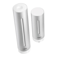
| Indoor Module Dimensions | 45x45x155 mm |
| Outdoor Module Dimensions | 45x45x105 mm |
| Rain Gauge Dimensions | 13x13x11 cm |
| Anemometer Dimensions | 85x85x110 mm |
| Outdoor Module Power Supply | 2 AAA batteries |
| Connectivity | Wi-Fi |
| Sensors | Temperature, Humidity, Sound, Rain, Wind |
| Wind Speed | 0 to 160 km/h |
| Alerts | Customizable alerts |
| Power Source | Battery and USB power |