Page | 9
You can draw graphs from the lists of data using (q)
Telling the calculator
what type of graph and
which list(s) to use.
The settings depend on
the type of graph – see
examples below.
Hint: you can set 3 graphs
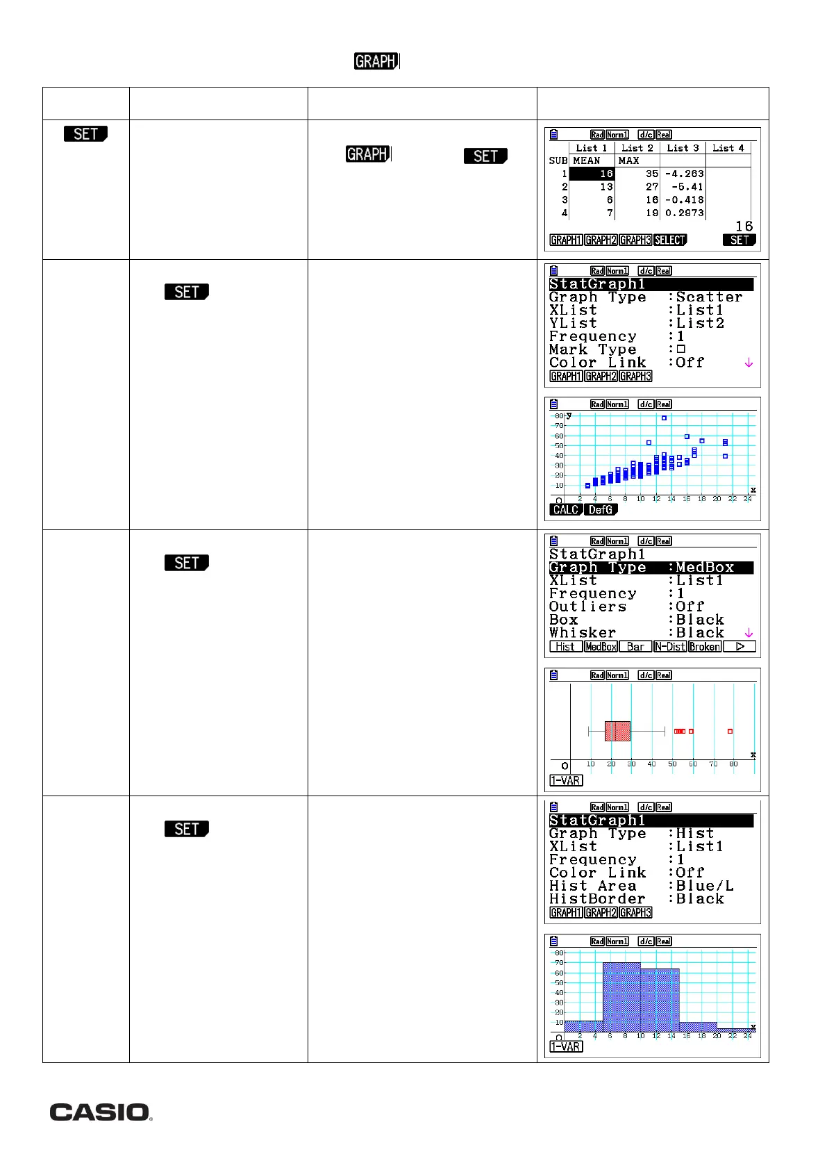
From the statistics menu press
q( ) then u ( ).
Choose which graph number you
wish to set (q,w,e).
Press d to return to the graph
screen.
Draw a SCATTER GRAPH.
Use above and
the following setttings:
GRAPH TYPE: Scatter
(q)
XLIST: List number with
your 1
st
set of values
YLIST: List number with
your 2
nd
set of values
FREQUENCY: 1 or List of
frequencies
The other settings allow
you to set colours and
mark type.
From the graph screen press the
key for your graph in SET
You can draw the regression line
(line of best fit). From the graph
plot, press qwwu for a
linear regression.
Draw a BOX PLOT
Use above and
the following setttings:
Graph Type: MedBox
(uw)
XList: List number with
your values
Frequency: 1 or List of
frequencies
Outliers: Off (default) or
On
The other settings allow
you to set colours.
From the graph screen press the
key for your graph created in SET.
Hint: You can find the values of
each quartile by pressing
Lq (TRACE) and using the
cursor !$
Draw a HISTOGRAM.
Use above and
the following setttings:
GRAPH TYPE: Hist
(uq)
XLIST: List number with
your values
FREQUENCY: 1 or List of
frequencies
The other settings allow
you to set colours.
From the graph screen press the
key for your graph created in SET.
Enter the START value (the lowest
value for the graph to start) and
the WIDTH of each interval. Then
press l
 Loading...