2.2) Graphs and information explained
The information displayed by the page depends on the sensors installed; currently, the relative
humidity sensor and the anemometer are optional, so may be shown or not.
The elements of every graph are very similar:
Current data is shown in a bright line (green for sky temperature), yesterday's as a more pale
line.
A dotted orange line marks the boundary between safe and unsafe. Finally the three
background colors match the three ranges specified (clear / cloudy / overcast, for sky
temperature, etc.)
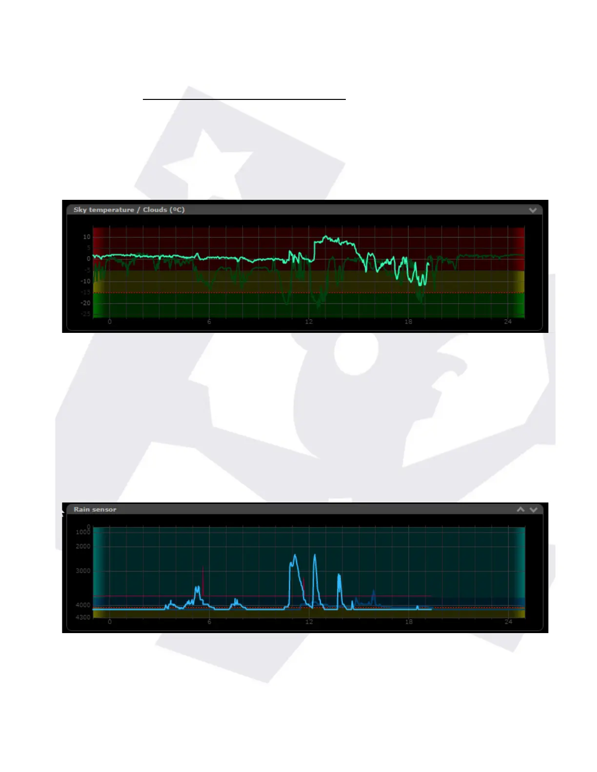
Some graphs however have some specificities. The rain graph, apart from the rain value (lower
values indicate rain), also shows a red line reflecting the sensor heater behaviour.
In this example can be seen the activity spikes of the heater matching the rain periods.
The wind graph (and icon at the top), will show the average wind speed as a line, and the gust
as a dot:
SOLO - Users manual v. 2.5 6/20 19. Jan. 2021
 Loading...