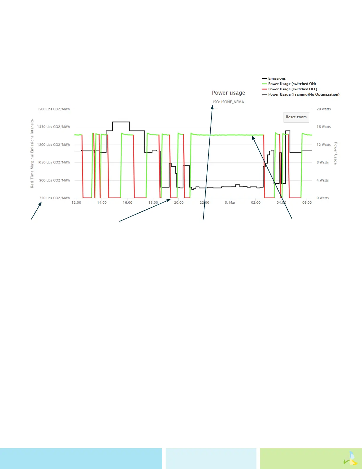
Interpreting the Dashboard
AER uses real-time, location based marginal emissions rates to optimize your device to run on cleaner energy. This
graph shows the real-time emissions rates and how your device responded to that constant uctuation.
A dashboard for a device that’s been running awhile will look something like this:
The y-axis is the real-time marginal emissions rate and the x-axis is the time of day.
You can see your device consuming electricity via the green line and turning o via the red line, all while operating within
the windows you set for the acceptable run times for that device. The o times generally correspond to the changes you
see in the emissions. An emissions rate greater than 1,800 lbs CO2/MWh indicates that coal is likely on the margin. An
emissions rate between 1,000 lbs/MWh and 1,800 lbs/MWh means that a natural gas plant is likely on the margin. Below
1,000 lbs/MWh, it is likely that renewables or ecient natural gas plants are providing marginal electricity.
You can see when your
device is consuming
electricity.
This is when your device
is switched o because
of increased emissions.
This is the grid region
your device is located in.
The y axis is the re-
al-time marginal emis-
sions rate.