Chapter 9 Creating Charts 163
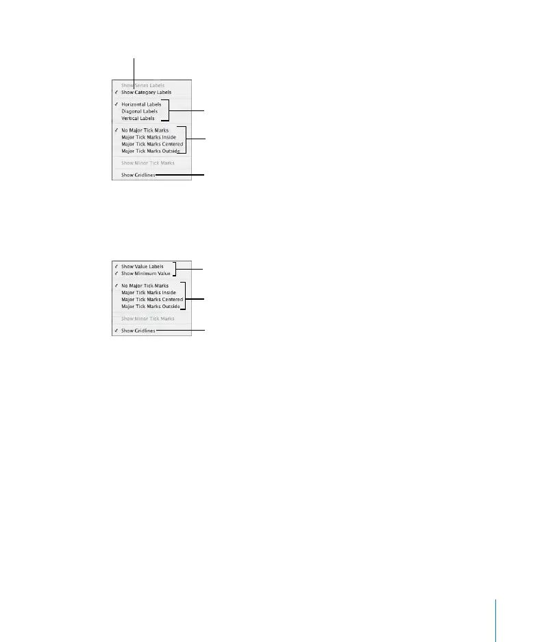
4 To add grid labels and tick marks to the value axis, choose from the Y-Axis pop-up
menu. (For horizontal bar charts, choose from among these same options in the X-
Axis pop-up menu.)
Formatting the Elements in a Data Series
You can display the numerical value for each data point in a series.
To add data point labels:
1 Select the chart or an element in a data series.
For all chart types except pie charts, selecting one element (bar) of a series
automatically selects the full series. For pie charts, you can select individual wedges.
2 In the Chart Inspector, click the Series button.
3 Choose Show Value from the Data Point Settings pop-up menu.
Place tick marks along
the X-axis.
Show or hide the X-axis
gridlines.
Set the text direction for
the series axis labels.
Show or hide series axis
labels.
Place tick marks along
the Y-axis.
Show or hide the Y-axis
gridlines.
Show or hide value axis
labels.