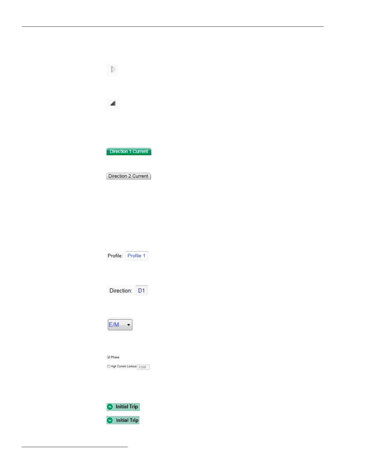
Navigation Tree
Expand Arrow
Indicates the item to the right is collapsed
with additional items underneath.
Clicking this icon expands the list to
show the hidden sub-items.
Collapse Arrow
Indicates the item to the right is expanded,
showing additional items underneath.
Clicking this icon collapses the list to hide
the displayed sub-items.
Sub-screen Selection Tabs
Active Tab Green indicates an active screen tab.
Inactive Tab
Grey indicates an inactive tab. Clicking
on an inactive tab changes from the
active screen to the screen associated
with the tab.
IntelliLink
®
Setup Software
Screen Area and Data Entry
The screen area contains various data objects used for conguring the control as well
as some features for displaying and accessing the data objects. The basic data objects
contain text boxes for direct text entry and list boxes for data selection.
Editable
Text Boxes
Text boxes with white background and
light blue text indicate editable content.
The cursor will change when hovering
over and editable eld.
Non editable
Text Boxes
Text boxes with a grey background and
dark blue text indicate dynamic text that
is populated by the control. This text
cannot be changed.
List Boxes
List boxes as indicated by the down arrow
supply a list of choices when selected. The
current selection will either be shown on
the list box or in an adjacent text box.
Check Boxes
Check boxes will be provided for enable/
disable decisions. Data elds for disabled
items will be automatically hidden or
grey-shaded. Data fields for disabled
items cannot be changed.
Text Expanders
Expanders are provided to help manage
the view. When the data below the
expander is visible, the expander icon
arrow points up. Clicking the icon
collapses or hides the data from view.
When the data are hidden, the expander
arrow points down. Clicking the icon
displays the hidden date.
18 S&C Instruction Sheet 1045-530
 To Next Page