Standard elements in list items, associated with columns, are:
column A - small graphic (icon)
- item number (see section Numbered items)
column B - heading (title or attribute of the item)
column AB - heading (title or attribute of the item)
- large graphic (e.g. icon or image thumbnail)
column C/BC/ABC - main text of the item
List item types
The appearance of list items can be chosen from the following types. The examples
are from lists displayed in main pane; for most item types a similar component for
use in pop-up windows do exist.
single-line item
Figure 5-23.
main text only (columns ABC)
usage:
- menu lists
- selection lists, markable lists
There is a corresponding component for pop-up
windows, without the line on the left side.
single-line item with heading
Figure 5-24.
heading text (AB), main text (C)
usage:
- menu lists
- selection lists, markable lists
There is a corresponding component for pop-up
windows.
single-line item with graphic
Figure 5-25.
small graphic (A), main text (BC)
usage:
- menu lists
- selection lists, markable lists
- multiselection lists
There is a corresponding component for pop-up
windows.
45
 To Next Page
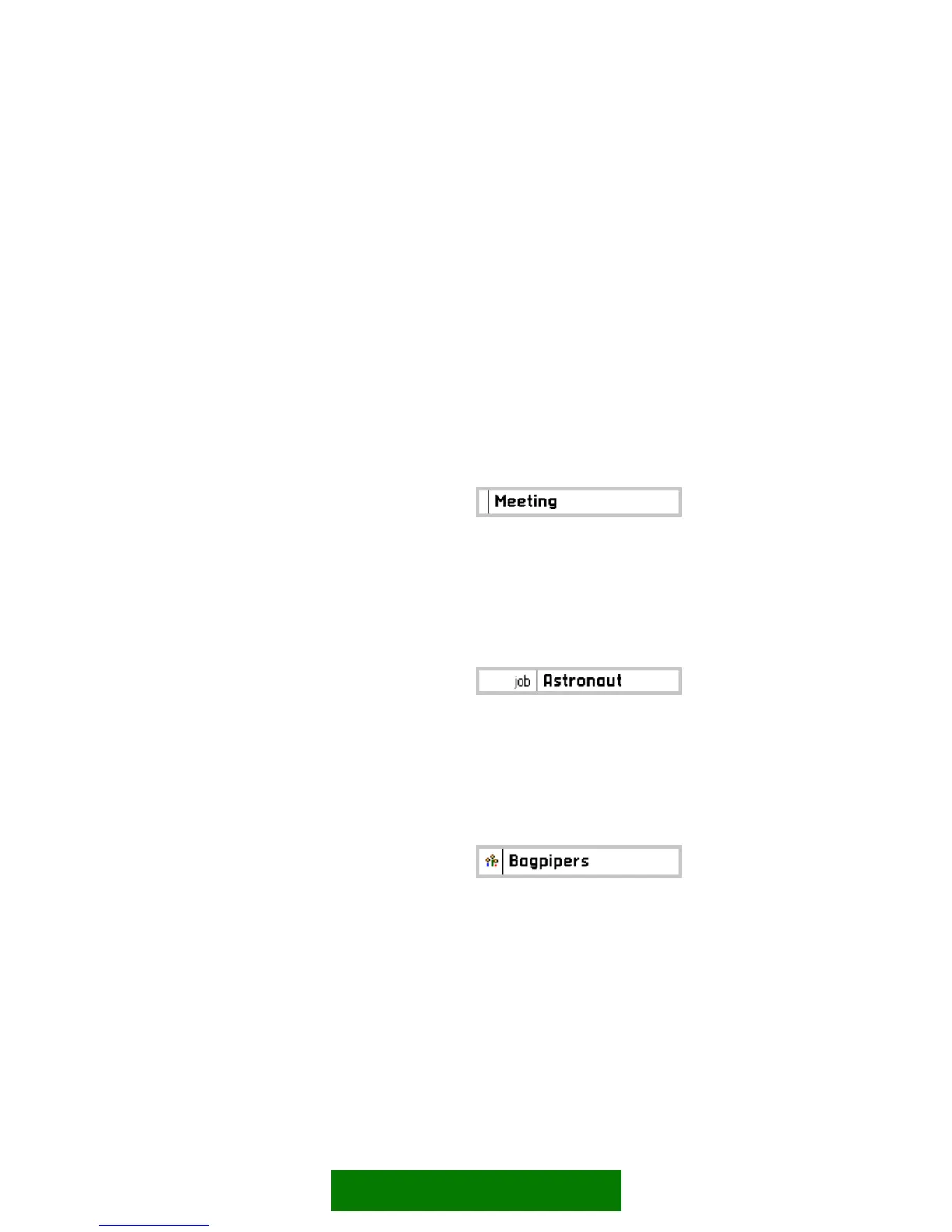 Loading...