11. Press the Run/Stop front panel button to
stop acquiring.
12. Turn the Multipurpose a control to scroll
through Spectrum Slices.
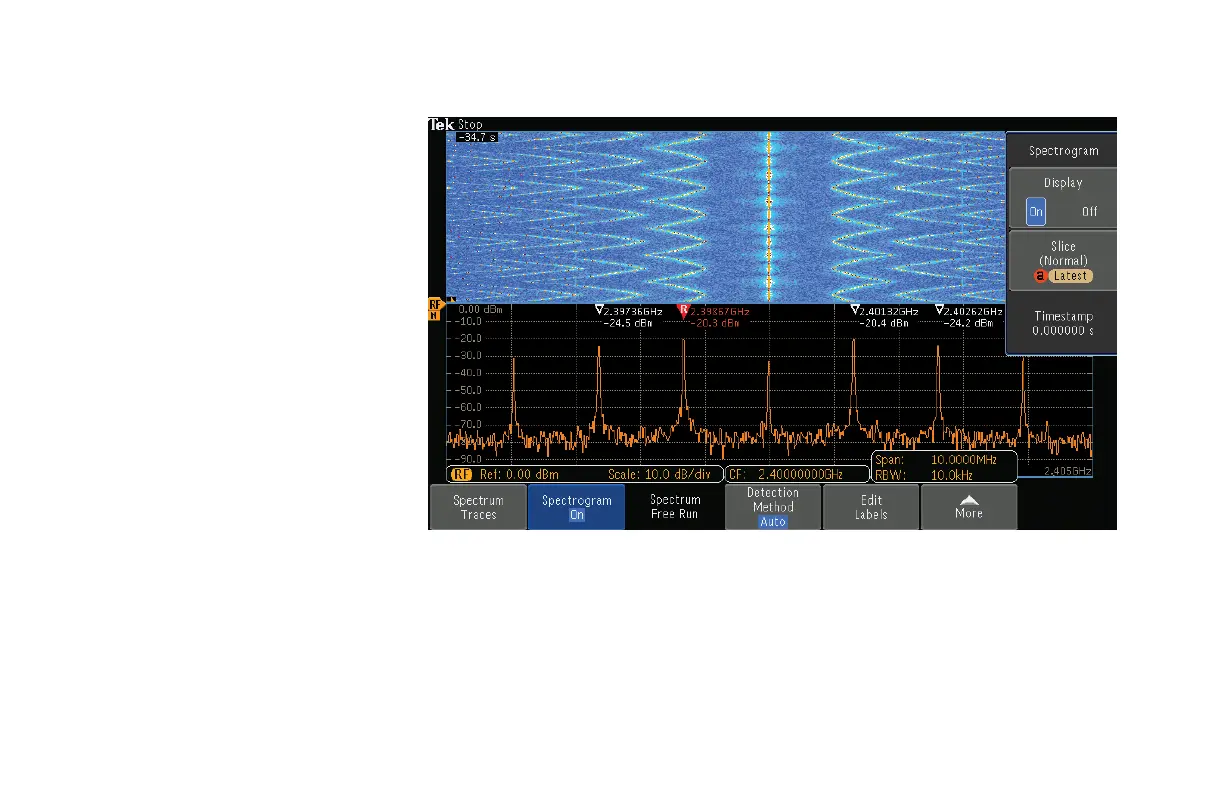
A Spectrogram shows how the
spectrum changes over time. The
x-axis is frequency, the y-axis is time.
A Spectrogram is created by taking
each spectrum and flipping it up on its
edge so that it’s one pixel row tall and
then using color to indicate amplitude.
Hotter colors (red, yellow) indicate higher
amplitudes while colder colors (blue,
green) indicate lower amplitudes.
Figure 28.
www.tektronix.com/mdo300038
MDO3000 Series Oscilloscope
Demonstration Guide
 Loading...