36
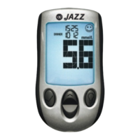
One dot represents 50 mg/dL.
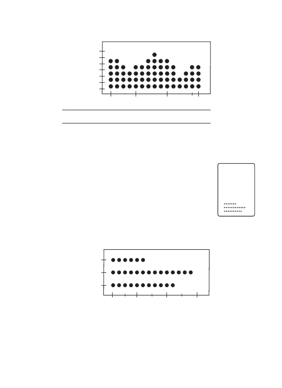
View 14, 30 and 90 Day Average Comparison
Graph: Press CENTER button to view your 14,
30 and 90 day average comparison graph. The
display shows an overview with three trend bars
comparing the 14, 30 and 90 days averages.
One dot represents 20 mg/dL.
30
90
14
5
1
10
14
Days
14 day view
30 day view
90 day view
10
2
20 30
30
6
60 90
100
300
200
0
mg/dL
30
90
14
100
20
200 300
mg/dL
Day Averages