In-Room Control on Touch10
for Cisco TelePresence
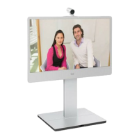
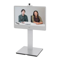
MX200 G2, MX300 G2,
MX700, MX800,
SX10, SX20, SX80
Collaboration Endpoint
software version CE8.2
D15358.02 - JULY 2016
www.cisco.com
© 2016 Cisco Systems, Inc.
All rights reserved.
10
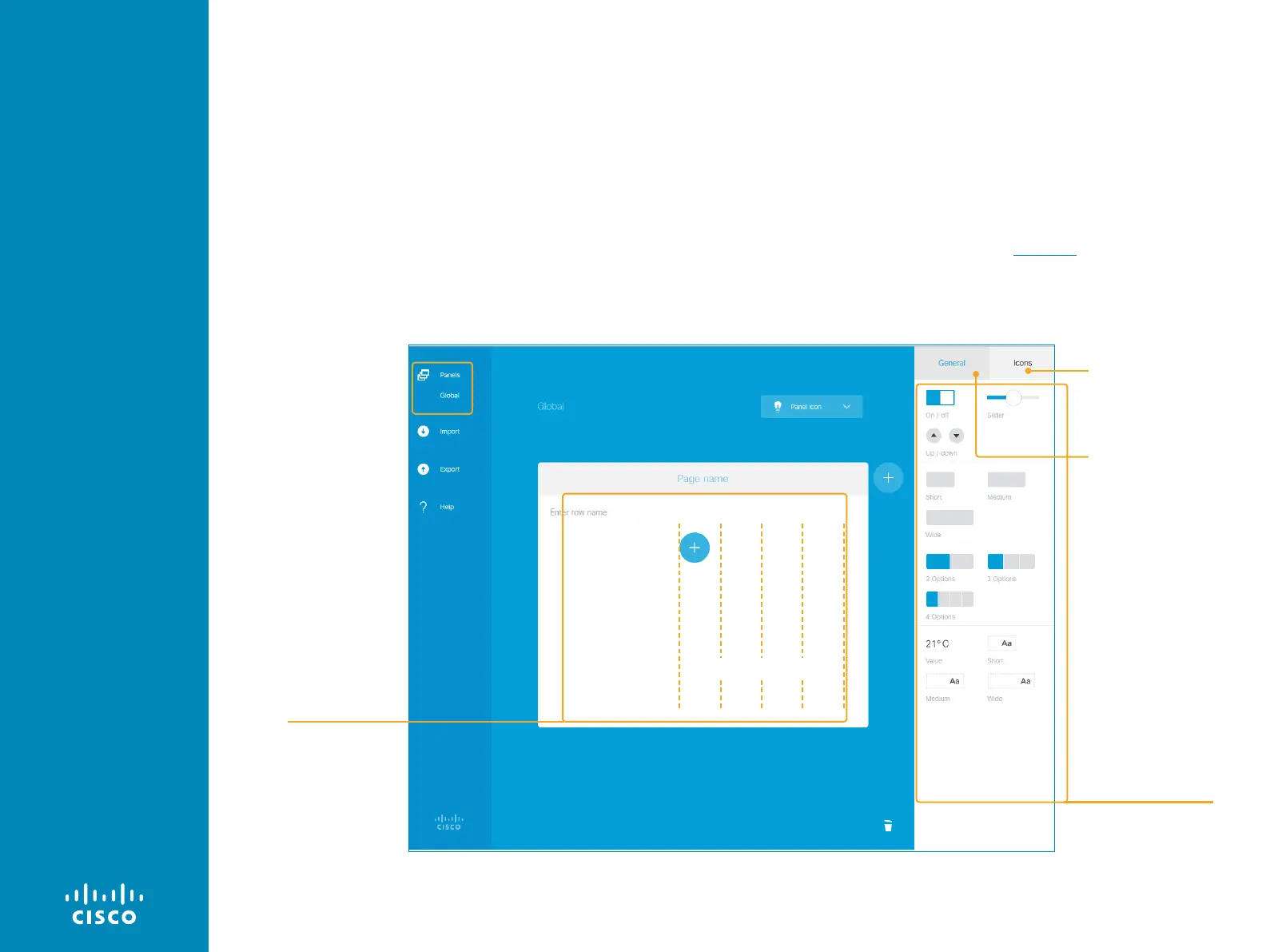
Populating the In-room Control panel
What you see in the editor's design panel is similar to how the in-
room control panel will appear on the Touch10.
An in-room control panel is arranged in pages. Each page consists
of one or more rows, which you can populate with text and user
interface elements known as widgets.
Widgets are arranged in a four-column grid. The widgets are placed
into the grid according to the following rules:
• A widget fills between one and four columns depending on its
size.
• Rows are right-aligned.
• If you add more widgets than fits in one line, widgets wrap to a
new line within the same row.
How you use the user interface elements for your meeting room is
up to you. You can, for example, create panels with preset buttons
for lights and blinds, or support for more complex scenarios such as
controls for many microphones in a large meeting room. You can find
some examples for inspiration in the Examples chapter.
More on how to create the panel can be found on the next page.
The in-room control editor. Widgets from the widget library are placed in a four-column grid.
Design panel
Widget library
Four-column grid
Buttons with familiar
symbols like home,
power, arrows, camera
and loudspeaker controls,
media player controls
Buttons with custom text,
group buttons, toggle
button, sliders, spinners,
and other elements
Page shows a setup of a
Global in-room control,
but the principles apply to
all three sets of in-room
controls.
Any panels already created,
appears in a list beneath
the Panels button. To create
more panels, click Panels.
This will show the panel
front page again. Choose a
new panel to create, or click
an existing one to continue
editing it.
This is how a panel looks before you have started to populate it.


 To Next Page