NV10/NV7.5 Operations and Maintenance Manual Operating the transmitter
Issue 3.4 2016-08-03 Page 2-43
The plot consists of a group of sequential samples to allow signal analysis. In L and R mode,
the L+R portion of the signal tends to dominate the plot, resulting in the majority of samples
appearing in the lower, left and upper, right quadrants. In I and Q mode, signals that are of
equal frequency and 90 degrees out-of-phase result in a circular display.
Use the maximize or minimize buttons as required..
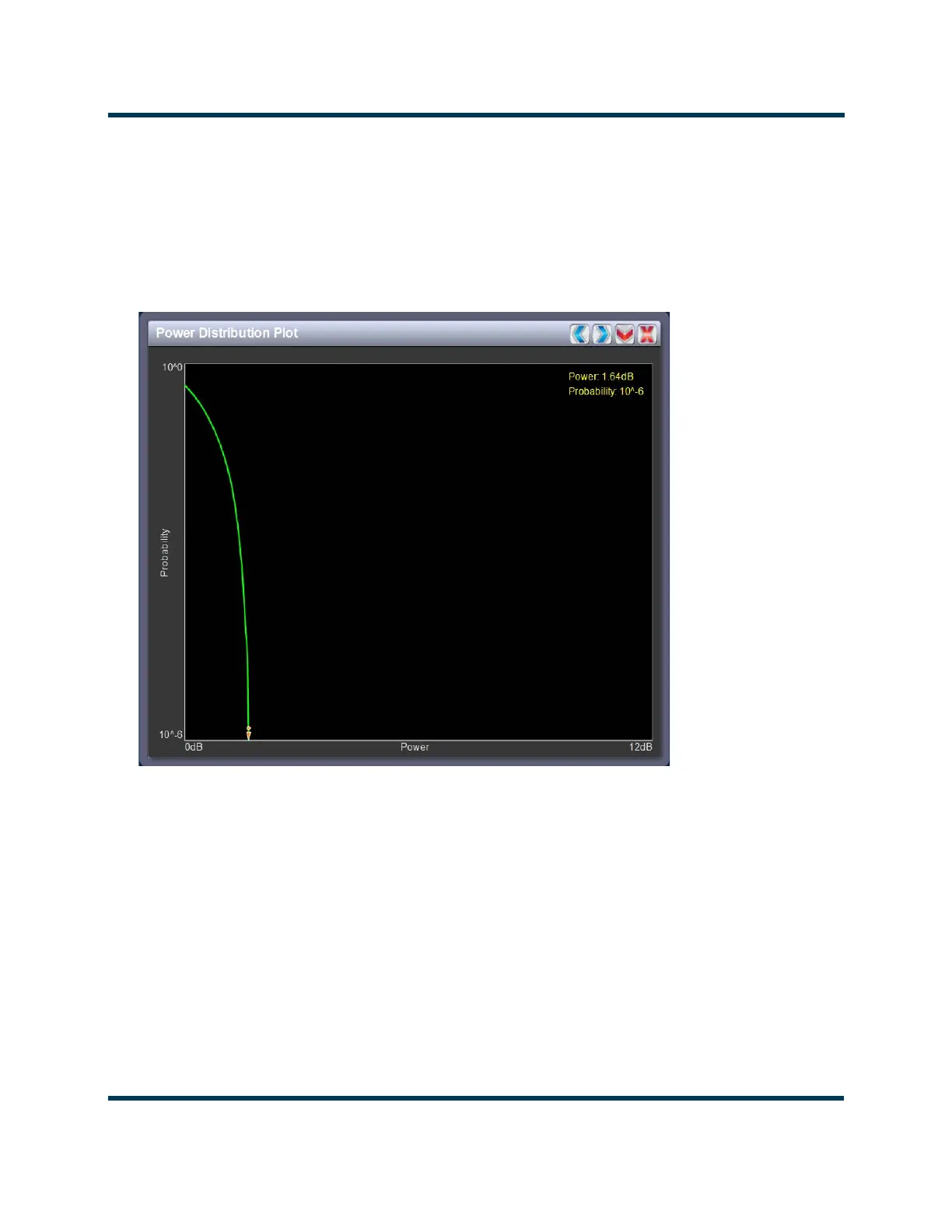
Figure 2.29: Power Distribution Plot
Power distribution plot
See Figure 2.29. The exciter measures the relative power levels of the signal and determines the
probability of exceeding a given power level, relative to the average power. The data is plotted
in the Power Distribution Plot as a CCDF (complementary cumulative distribution function).
The x-axis displays the relative power level in dB, with the reference representing the average
power. The average power is 0db. The y-axis displays the probability of exceeding that power
level. This plot can be used to assess the distribution of a given signal, and provides an
indication of the amount of peak power capability required
from the transmitter in order to
prevent peak clipping/distortion of the output signal.