Design Section 4 Engineering Interface
68 3BSE042835-600
possible to have separate buttons (for example, pairs Apply/Undo) for the different
logical groups.
Figure 15. Grouping of option buttons.
The following rules should be used in the control
module for the interaction
window:
• Grid size = 0.02
• Text height = 0.1
• Text height for group = 0.08
• Distance to borders = 0.02
• Distance between texts in a group (vertically) = 0
• Distance between groups can vary, yet be at least 0.02
• Straight (aligned) columns in each group
• Check boxes, option buttons and input fields are used for inputs
• Icons can be used for distinct indications. It is also
permitted to use check
boxes and option buttons in the same way as a dynamic input field
• “Apply” / “Undo” buttons when two or more interdependent input
fields. The
buttons should have size 0.3x0.1
• Input fields should be center aligned
• For option buttons and check boxes, the te
xt should be to the right of the
interaction object.
• The caption texts in an operator window should have the height 0.16.
• A value may have a ResetIcon to the right. Sel
ecting the ResetIcon will reset
the value (to initial value) or, in some cases, other reasonable values.
• Color assignment shall follow common guidelines and re
gulations, for example
red for alarm indication, and yellow for warning indication. Use project
constants (cColor) to assign colors to objects.
 To Next Page
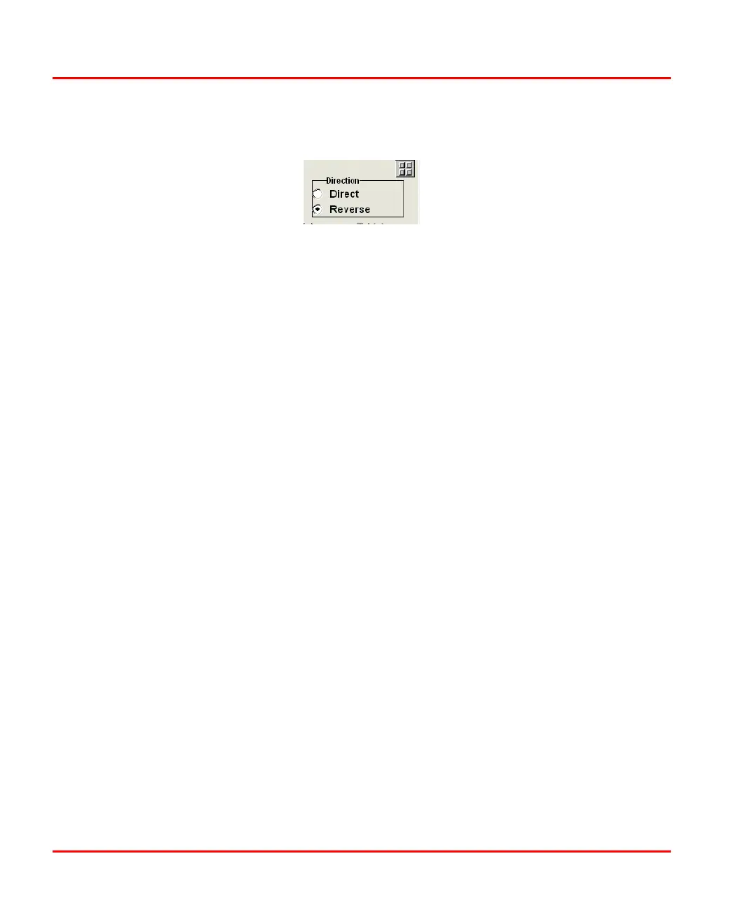 Loading...


