l All the printouts must be on the label, and nothing should be printed on the bottom page
of the label.
l Contents in the cells should be aligned in the center. In a single-line printout, the dividing
lines and the mark "To:" should not be covered by the printed characters.
l When the cells are merged and the printouts are made in multiple lines, avoid covering the
mark "TO:" when printing the texts the space bar to move the printing contents to the next
line.
B.1.4 Writing Labels
Writing Tools
To make sure the printouts are clear and legible, use the black oiliness markers instead of ball-
pens to write the labels.
In special cases, black ball-pens are allowed, although not recommended. Compared with ball-
pens, oiliness markers are better. When writing with the ball-pen, take care not to leave the oil
on the label, which may contaminate the label and blur the words.
NOTE
The delivered marker has two nibs. Make sure to use the smaller nib to write the labels.
Font
For the sake of easy recognition and good looking, the font in handwriting should be close to
the standard typeface (Times New Roman) as much as possible. Table B-1 shows the standard
typeface.
Table B-1 Standard Typeface for Handwriting
0
1 2 3 4 5 6 7 8
9 A B C D E F G H
I J K L M N O P Q
R S T U V W X Y Z
Write the characters in proper size. The characters should be clear, distinct, and tidy.
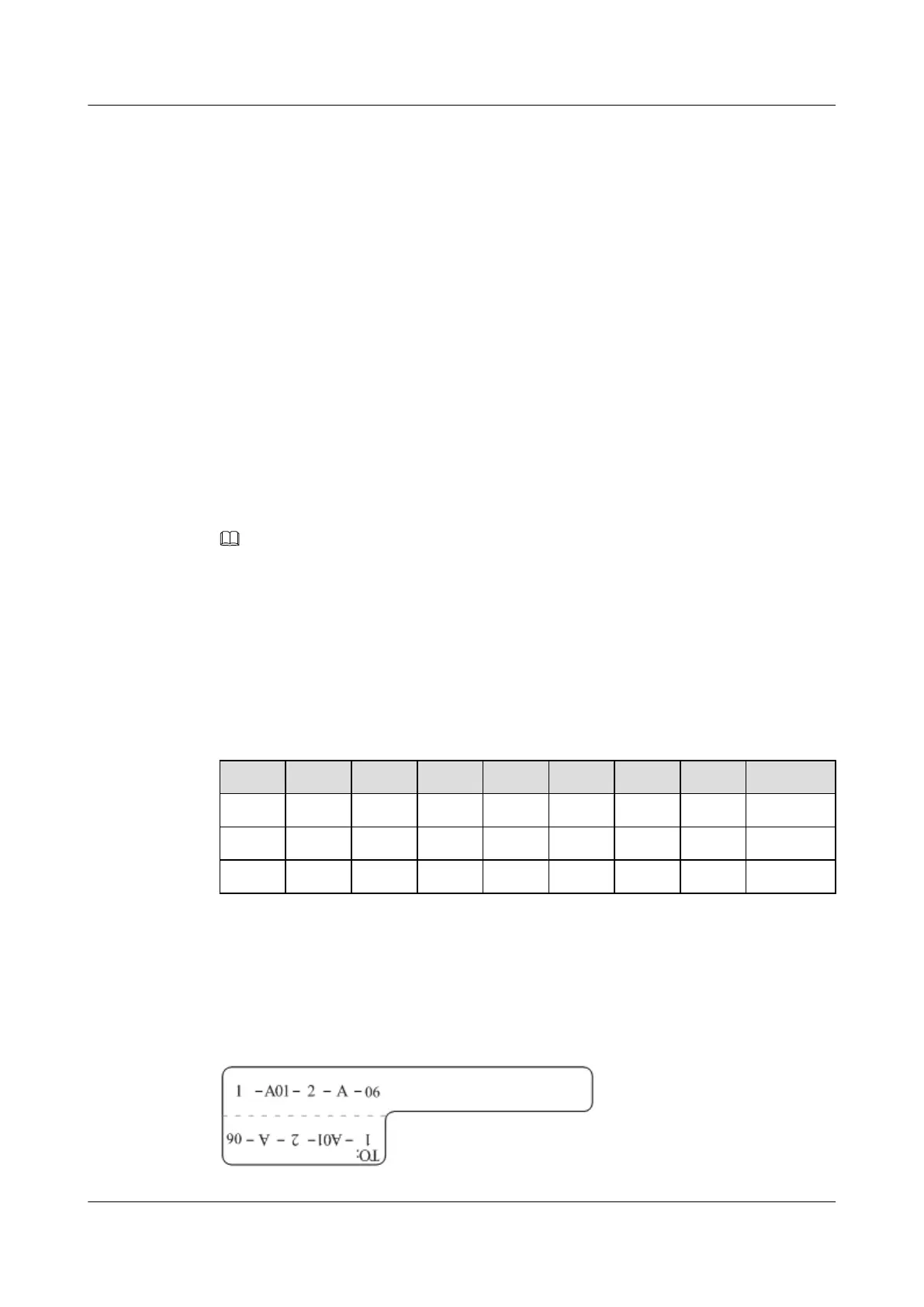
Writing direction: The direction is as shown in Figure B-4:
Figure B-4 Writing direction of the characters on the label
B Engineering Labels for Cables
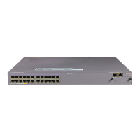
Quidway S5300 Series Ethernet Switches
Quick Start
B-6 Huawei Proprietary and Confidential
Copyright © Huawei Technologies Co., Ltd.
Issue 01 (2008-12-26)
 Loading...