Affinity Instructions for Use - US Page 45
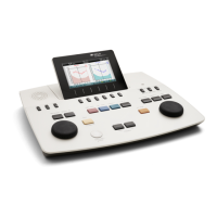
Start/Stop button initiates and ends all tests.
Note that after pressing START the text on the button will
change to STOP.
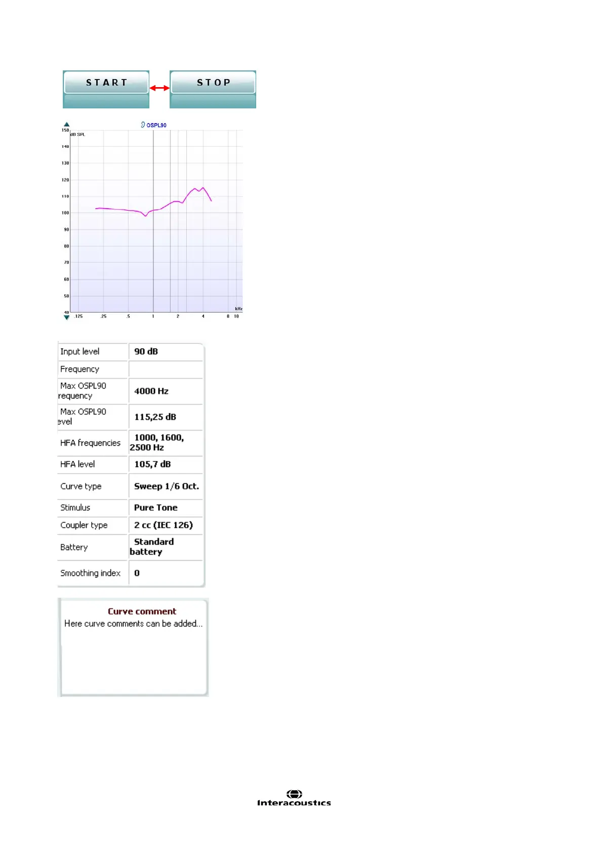
The Graph shows measured HIT curves. The X
axis shows the frequency and the Y axis shows
o
uput or gain, depending on which measurement
is printed above the graph
together with a right/left indication. In this example
the OSPL90 is displayed for the left ear.
using the slider on the right
nd side.
NOTE: for the industry standard protocols (ANSI
and IEC), the input level is dictated by the standard
and cannot be changed.
on the left hand side allows
for scrolling the graph up or down ensuring that the
curve is always
visible in the middle of the screen.
Measurement details: In this table the curve
details can always be viewed. This way the
professional always has an overview of what is
being measured. Read information such as Input
Level, Max SPL, Curve Type, Stim
ulus, and Curve
A Curve Comment for each curve can be typed
into the comment section on the right hand side.
Select a curve using the curve tag boxes under
Curve display options and write a comment in the
comment section.
The comment will then appear in the comment
section whenever the curve is selected.