22
SMILE B3 PLUS
Statistical Diagram
Click Statistics on the home page to view the Statistical
Diagram.Selecttheenergygraphorspecicrangeofdates
to view your historical data corresponding to that period.
Users can also toggle between Day, Month, Year and Since
Installation to view relevant energy data.
Description:
All values are displayed in kWh.
• Orange (PV Generation): Total PV generation
• Red (Feed-in): Total grid feed-in electricity
• Blue (Loads): Total load consumption
• Brown (Grid Consumption): Actual consumption from
the grid.
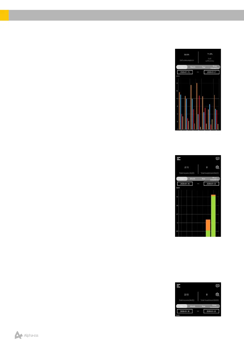
Prot Diagram
Click on ProtonthehomepagetoviewtheProtDiagram.
Selectthegraphorspecicrangeofdatestoviewyour
historical data corresponding to that period. Users can
toggle between Day, Month, Year and Since Installation to
viewappropriateprotdata,asshownbelow.Theappalso
displays the Total Income and Total Investment depending
on the Values set by the user/installer.
Description
All values are calculated in $, as set by the customer/
installer.
• Feed-in: Income from grid feed-in (as per applicable
feed-in tariff)
• Self-consumption: Income from Solar PV-generation
• Load shifting: For Time-of-Use tariff users, this value corresponds to the
Income generated from charging the battery during Off-peak hours (at low
electricity price) and discharging towards the loads during Peak / Shoulder
hours (at high electricity price).
Electricity Prices Settings
WithintheProtdiagrampage,userscanselecttheir
Electricity Price Settings by clicking the Settings (Scroll
Wheel) icon on the top-right hand side corner of the page.