68 Chapter 6
Placing Grid Labels and Tick Marks
The X-Axis and Y-Axis pop-up menus in the Axis pane of the Chart Inspector provide an array
of options for placing tick marks and labels along the value axis or the series axis. These pop-
up menus, pictured below, contain different options depending upon which kind of chart
you have selected.
For vertical bar charts (column charts), line charts, and area charts, the Y-axis is the value
axis, while the X-axis is the series axis; for horizontal bar charts, the X-axis is the value axis.
Here, pop-up menus are pictured as they appear when a column chart is selected.
X-Axis Markings (or Series Axis Markings)
To place grid labels and tick marks along the series axis:
m For a column chart, choose options from the X-Axis pop-up menu in the Axis pane of the
Chart Inspector. (For horizontal bar charts, choose from among these same options in the
Y-Axis pop-up menu.)
Y-Axis Markings (or Value Axis Markings)
To place grid labels and tick marks along the value axis:
m For column charts, choose options from the Y-Axis pop-up menu in the Axis pane of the
Chart Inspector. (For horizontal bar charts, choose from among these same options in the
X-Axis pop-up menu.)
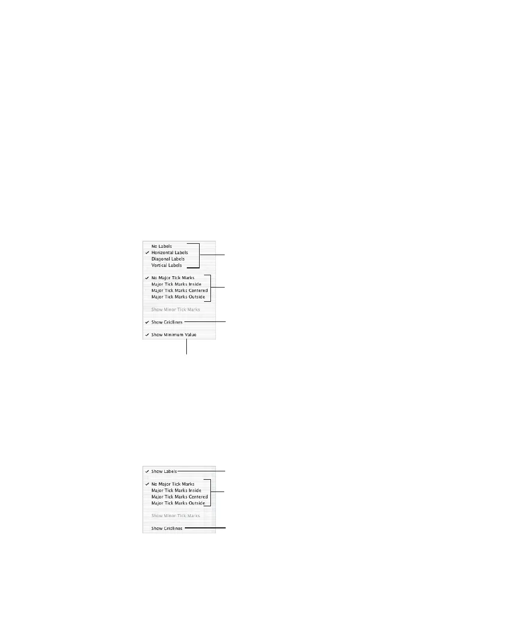
Place tick marks along
the X-axis.
Show or hide the X-axis gridlines.
Set the text direction for
the series axis labels.
Show or hide the minimum
data value on the series axis.
Place tick marks
along the Y-axis.
Show or hide the
Y-axis gridlines.
Show or hide the value axis labels.
 Loading...