LVS-7500 External System Operations Manual
LVS-7500 External System Operations Manual Page 30 of 129
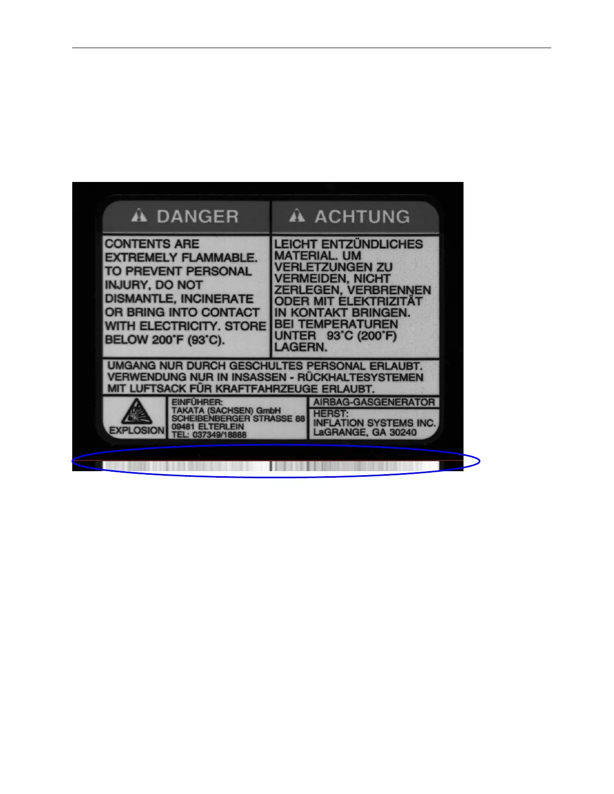
As you can see there are portions of this image attached to the right (after the red line) that look similar. These
portions are the where the text goes across the label. The part we are most interested in seeing are the portions
that had the black lines going across the image. The image below shows three definite sharp black lines that are
unequally spaced apart. This is good as they cannot be mistaken for one another. The black line closest to the
top also has a large darker portion above it since the label had a darker border around the words “Danger” and
“Achtung”. Solid lines are good to utilize, especially when unevenly spaced.
Now following the same principal going down in columns from top to bottom we get a picture that looks like this
(see below).
This example has much less definition through the whole image when looking at the average across the bottom
of the label (below the red line). The large vertical black line that was through the center has made itself the most
obviously defined dark line on the lighter background. Also the spaces between the print through the center of
the label have made the average to the left of the center black line very light in contrast.
Since the smaller the synchronization portion of an image is, the faster it is to process, we can make a guess at
the best area to use as a synchronization slice, which is the smallest portion of the image possible to hold good
image registration. Below is the image of where we would want to designate as our “sync slice”.
 Loading...