Notes on ergonom ic colour adjustmen
t
Notes on ergonomic colour adju
stment
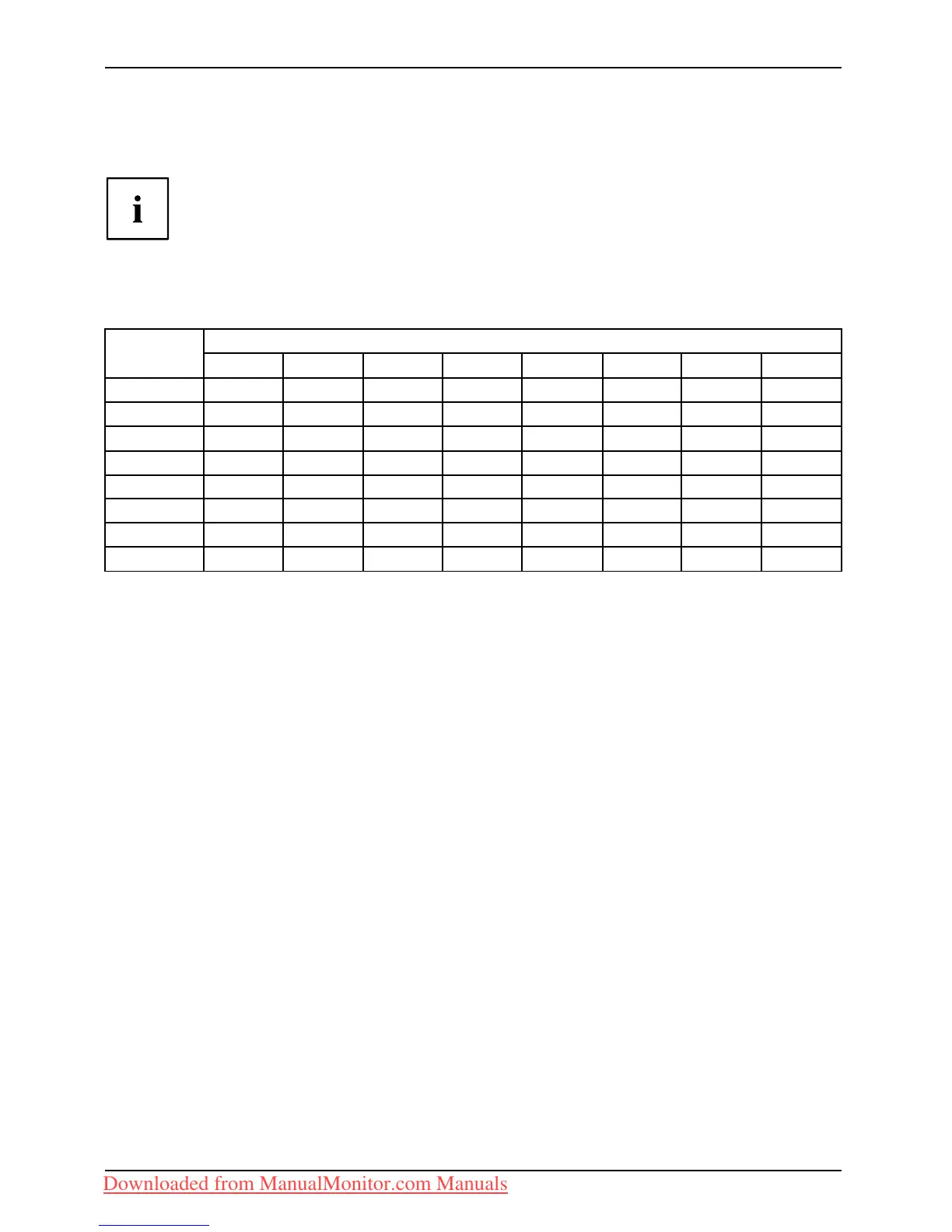
If you select colours for the monitor in your application programmes,
take note of the information below.
The primary colours blue and red on a dark background do not produce the minimum
required contrast of 3:1 an d are there fore not suitable for continuous text and data entry.
When using several colours for characters and backgrou nd and g iving the primary colours full
modulation, you can obtain very suitable colour combinations (see the following table):
Characters
Background
black white purple blue
cyan green
yellow red
black
++
-
+++
-
white
+++
---
+
purple
++
-----
blue
-
+
-
+
-
+
-
cyan
+
--
+
---
green
+
--
+
---
yellow
+
-
++
--
+
red
-
+
----
+
+ Colour combination very suitable
- Colour combination not suitable because colour hues are too close togeth er, thin characters
are not identifiable o r rigorous focusing is demanded of the human eye.
28 Fujitsu Technology Solutions
Downloaded from ManualMonitor.com Manuals

 Loading...