Best practice: Designing applications for different
languages and regions
Guidelines for layout
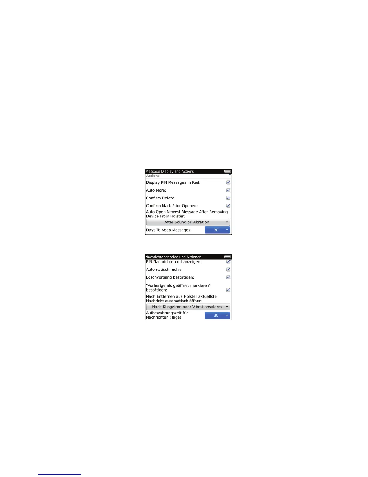
• Leave enough space in your UI for translated text. The height and the width of text might expand when translated from
English to other languages. For labels and other short text strings, prepare for up to 200% expansion. For lengthy text
(more than 70 characters), prepare for up to 40% expansion. Where possible, place labels above the associated field.
Leave blank space at the end of each label.
• Try to avoid displaying truncated text. The meaning might be unclear to users if the most important text does not
appear. First, try to reduce the size of the text. If you reduce the size but you cannot read the text easily, try wrapping
the text onto two lines instead. If you cannot wrap the text, consider using an abbreviation. Otherwise, use an ellipsis
(...) to indicate that the text is truncated and provide a tooltip.
• Consider the font size for languages that use diacritics. Languages that use diacritics, such as Thai, require more
vertical space. The diacritics are smaller than characters and might not appear clearly if the font size is small. Thai has
stackable diacritics that might increase the vertical spread of a string and exceed the pixel height of the font size.
• For languages that are displayed from right to left, make sure that the UI is a mirror image of the English UI. For
example, in Hebrew, the label for a drop-down list is displayed to the right of the list and the drop-down arrow is
displayed to the left of the list. Make sure that UI components align along the appropriate side of the screen based on
UI Guidelines Strategies
49
 Loading...