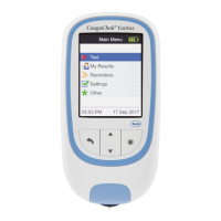
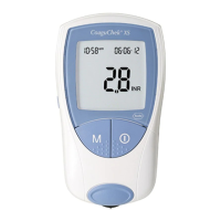
63
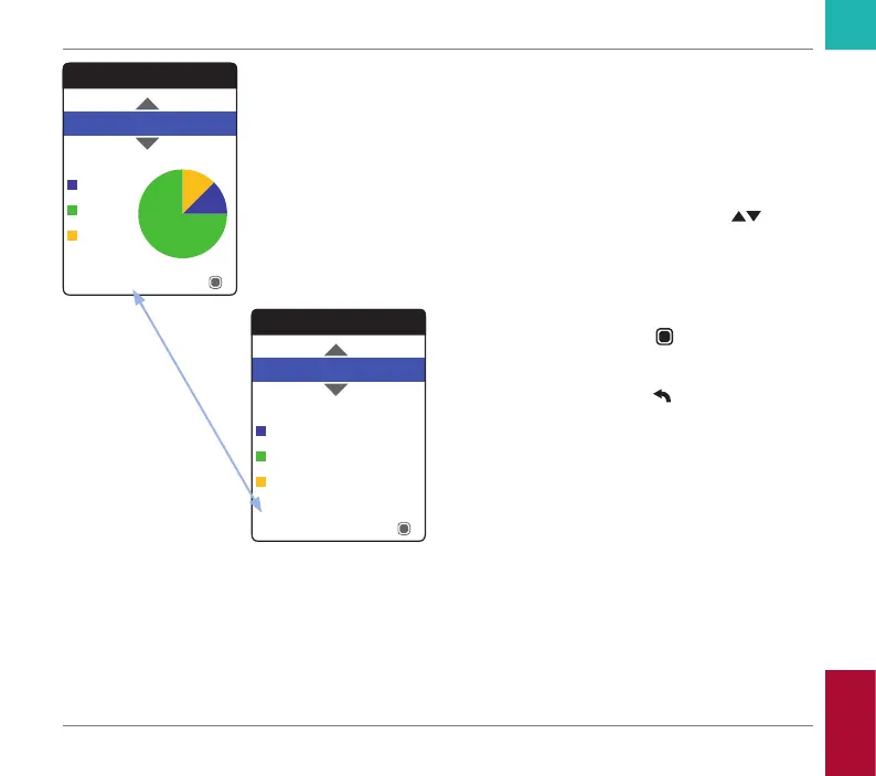
The percentage of values above, within and
below the set target range will be displayed
as a pie chart. The average (numerical) value
in the selected time period is also displayed.
If the selected period of time contains no test
results, no graph will be displayed.
5 Use the up/down arrows button
to select the time period you want to
evaluate. Starting from your most recent
test result, you can choose a time period
going back 60, 90, 120, or 180 days.
6 Press the Enter button
to toggle
between graphic and tabular display.
7 Press the Back button
to return to the
My Results menu.
Target
Table
90 Days
Average: 2.5 INR
Below
Above
Within
Target
Graph
12%
90 Days
Average: 2.5 INR
Below
Above
Within
75%
13%
Reviewing and Handling Data
CoaguChek Vantus User’s Manual, version 1.0