Material Example Guidelines
• Avoid rendering icons completely in gray. These icons can appear to be
unavailable.
Paper
• Add details such as lines or holes to make the icon more realistic, to
provide a better sense of scale, and to differentiate among types of
paper.
• Make shadows sharp for folds and diffuse for curls.
• Use color sparingly. In some cases, however, you might want to use color
to represent the actual object (for example, yellow for a memo).
Light
• Use light to represent intangible elements such as sounds, data flow, or
connection to a wireless network. Always combine light with another
material.
• Make sure that light is shown as curved. Allow the edges of the arcs to
fade out. The edges should not look solid.
• Make sure that objects paired with light reflect colors from the light
source on their surface.
• Be aware of the effect that color has when using light to represent sound.
For example, red arcs might appear loud.
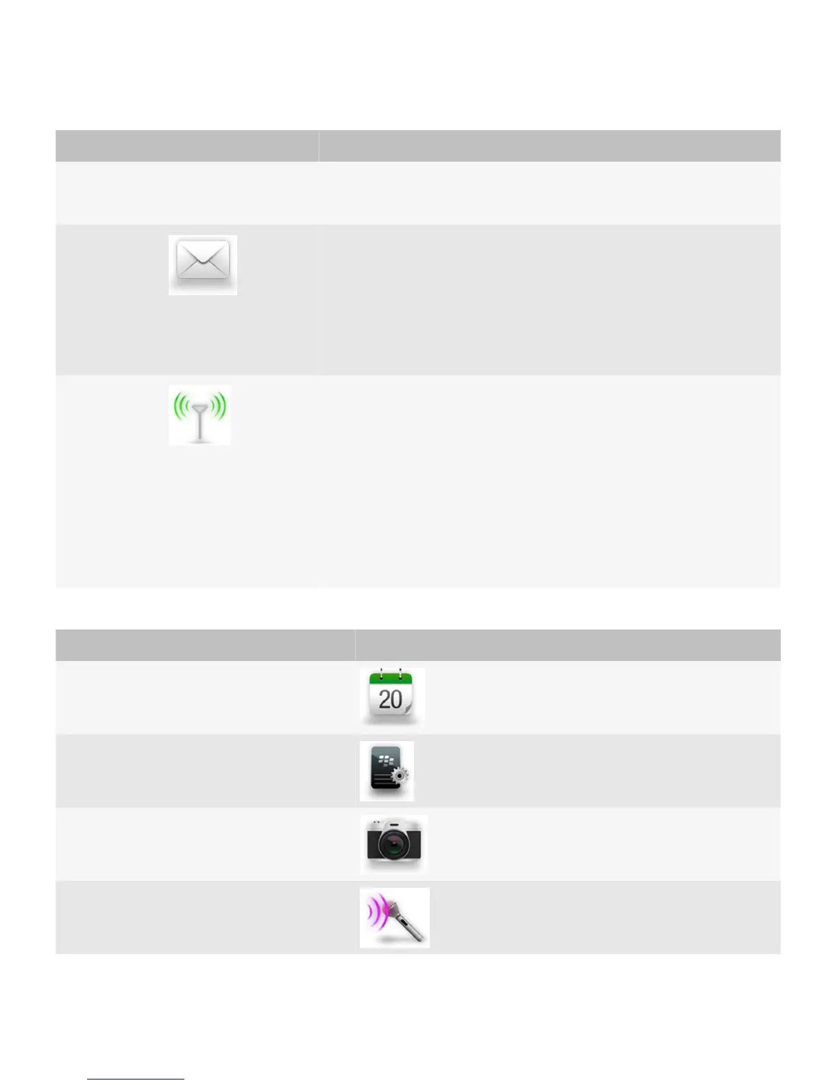
Examples of combinations
Combinations Example
Metal and paper
Metal and glass
Metal, glass, and leather
Light and metal
UI Guidelines Icons and indicators
96
 Loading...