• If an action is not possible for the current context but is possible for other items in the screen, dim the icon in the
toolbar.
• Include a maximum of five icons in a toolbar. If an application is available only in landscape view, you can add two
additional icons to the toolbar.
• Create icons with an average size of 33 x 33 pixels. These icons appear on a 60 x 40 pixel canvas and should have some
negative space.
• Use colors and shapes to differentiate similar icons. For example, use the BlackBerry 7 theme colors to distinguish
between the arrows for replying to and forwarding an email message. Vary the number and direction of arrows to
distinguish forwarding an email message from replying to an email message and replying to all in an email message.
Text fields
Labels
Use a label to display text that identifies a component.
Best practice: Implementing labels
• Use clear, concise labels.
• Try to avoid displaying truncated text. The meaning might be unclear to users if the most important text does not
appear. First, try to reduce the size of the text. If you reduce the size but you cannot read the text easily, try wrapping
UI Guidelines Containers and components
76
 To Next Page
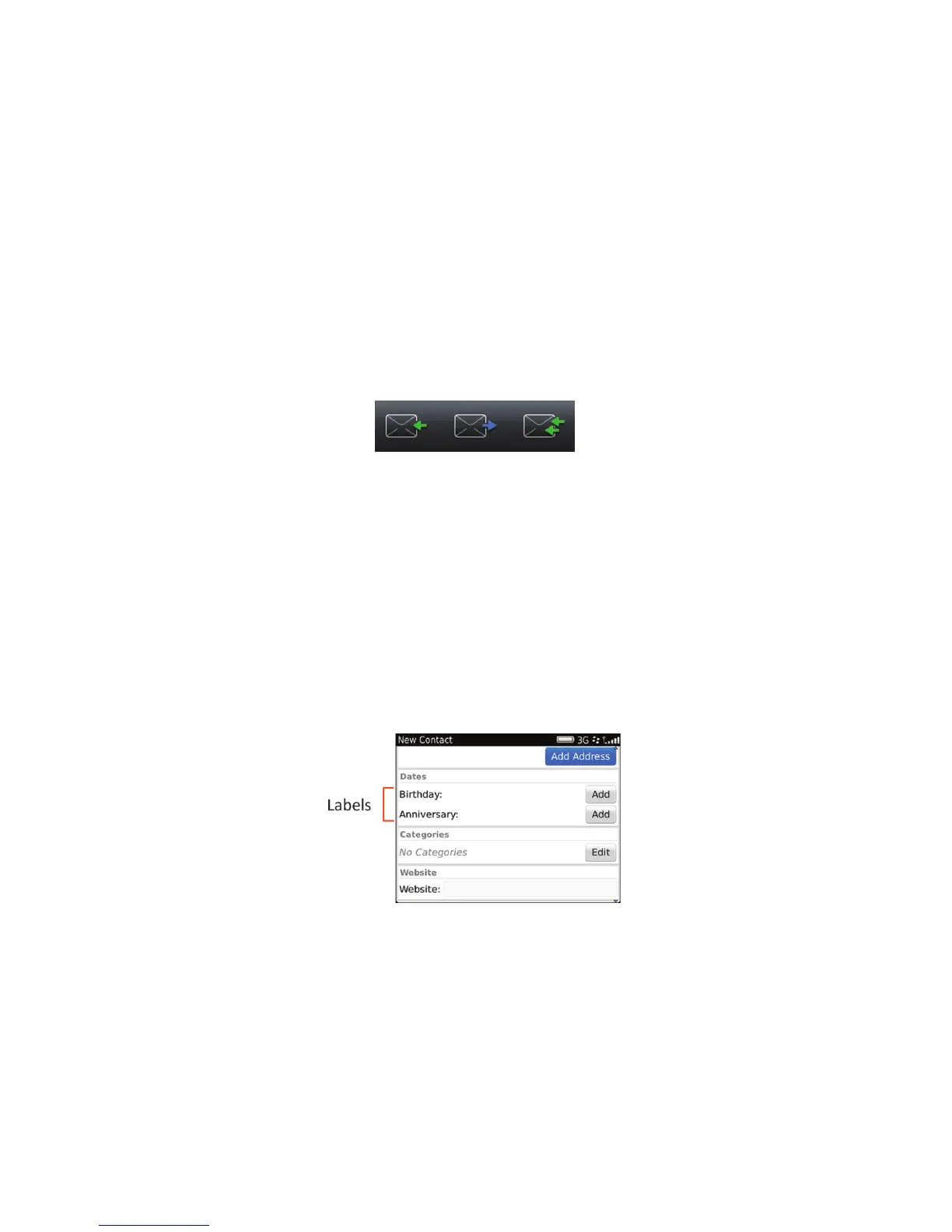 Loading...
 Need help?
 General