EAGLE™
User Manual
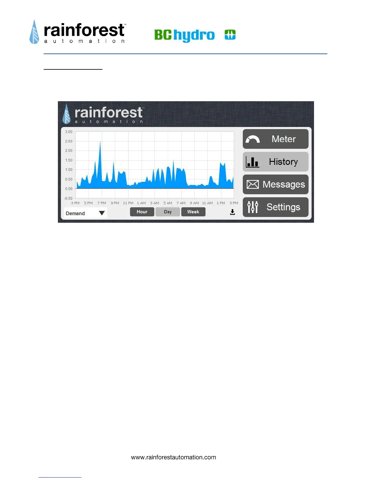
History Button
Clicking the History button takes you to a page that can display graphs of your
historical usage.
There are two display modes that you can select from the dropdown menu in the bottom
left corner of the screen:
Demand, shown above, displays the rate at which you are consuming energy, in
kilowatts, over time. This is shown as an area graph for the following time
periods:
o Hour – shows the last 60 minutes, with samples every 8 seconds.
o Day – shows the last 24 hours, with samples every 15 minutes.
o Week – shows the last 7 days, with samples every 15 minutes.
Consumption, shown below, displays the total historical usage, in kilowatt-
hours, as a bar graph for the following time periods:
o Day – shows the last 24 hours; each bar is consumption for an hour.
o Week – shows the last 7 days; each bar is consumption for a day.
o Month -- shows the last 31 days; each bar is consumption for a day.
o Year – shows the last 12 months; each bar is consumption for a month.
You can switch between the graph time periods using the buttons under the graph.