39
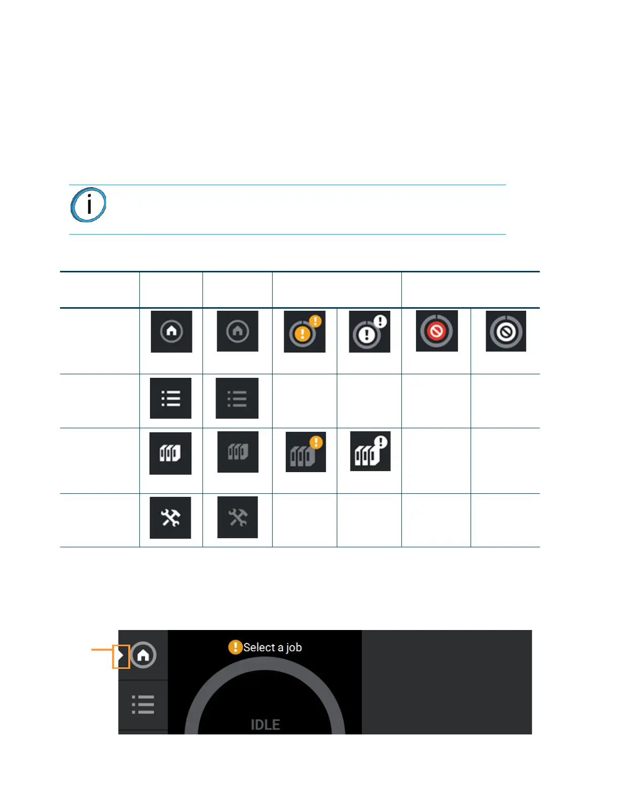
NAVIGATION MENU
The Navigation Menu provides one-touch access to the Build, Queue, Materials, and Tools functions of the
printer (see Figure 4-1 for details). The User Interface is broken up into several pages of related functionality.
Selecting a button from the Navigation Menu will open the button's corresponding page, allowing you to perform
tasks within that page. If a page contains sub-pages, additional buttons corresponding to these items will be
displayed within the page’s Display Area.
The buttons in the Navigation Menu are mutually exclusive, meaning only one button may be selected at a time.
In some cases, a notification badge will be displayed within the button indicating a warning related to the
functionality of the corresponding page. Buttons can appear as follows:
Table 4-1: Navigation Menu - Button States
After selecting a button from the Navigation Menu, a white indicator graphic will be displayed along the
left-center edge of the button. This graphic indicates which Navigation Menu item is currently selected, making it
easy for you to recognize which page of the UI you’re utilizing.
Figure 4-2: User Interface Overview
Note: The bottom-most button in the Navigation Menu is non-functional.
Button Name
Selected
State
Unselected
State
Warning
State
Error
State
Build Button
Unselected
Selected
Unselected
Selected
Queue Button N/A N/A N/A N/A
Materials Button
Unselected Selected
N/A N/A
Tools Button N/A N/A N/A N/A
Navigation
Menu
indicator
graphic

 To Next Page