35
– : Select the position of the overlay in the image.
• Widget: Linegraph : Show a graph chart that displays how a measured value changes over time.
– Title: Enter a title for the widget.
– Overlay modifier: Select an overlay modifier as data source. If you have created MQTT overlays, they
will be located at the end of the list.
– : Select the position of the overlay in the image.
– Size: Select the size of the overlay.
– Visible on all channels: Turn off to show only on your currently selected channel. Turn on to show
on all active channels.
– Update interval: Choose the time between data updates.
– Transparency: Set the transparency of the entire overlay.
– Background transparency: Set the transparency only of the background of the overlay.
– Points: Turn on to add a point to the graph line when data is updated.
– X axis
– Label: Enter the text label for the x axis.
– Time window: Enter how long time the data is visualized.
– Time unit: Enter a time unit for the x axis.
– Y axis
– Label: Enter the text label for the y axis.
– Dynamic scale: Turn on for the scale to automatically adapt to the data values. Turn off to
manually enter values for a fixed scale.
– Min alarm threshold and Max alarm threshold: These values will add horizontal reference
lines to the graph, making it easier to see when the data value becomes too high or
too low.
• Widget: Meter : Show a bar chart that displays the most recently measured data value.
– Title: Enter a title for the widget.
– Overlay modifier: Select an overlay modifier as data source. If you have created MQTT overlays, they
will be located at the end of the list.
– : Select the position of the overlay in the image.
– Size: Select the size of the overlay.
– Visible on all channels: Turn off to show only on your currently selected channel. Turn on to show
on all active channels.
– Update interval: Choose the time between data updates.
– Transparency: Set the transparency of the entire overlay.
– Background transparency: Set the transparency only of the background of the overlay.
– Points: Turn on to add a point to the graph line when data is updated.
– Y axis
– Label: Enter the text label for the y axis.
– Dynamic scale: Turn on for the scale to automatically adapt to the data values. Turn off to
manually enter values for a fixed scale.
– Min alarm threshold and Max alarm threshold: These values will add horizontal reference
lines to the bar chart, making it easier to see when the data value becomes too high
or too low.
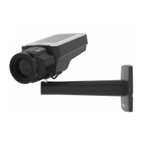
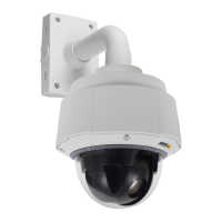
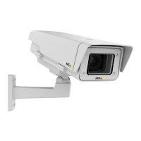
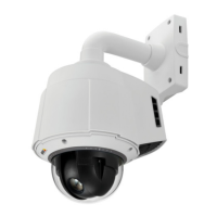
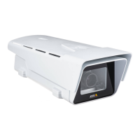
AXIS Q8752-E Mk II Bispectral PTZ Network Camera