SA Series Ambulatory Blood Pressure Monitor User Manual Analyzing and Editing ABP Data
- 27 -
Compare: compares the BP studies of one patient conducted in different periods.
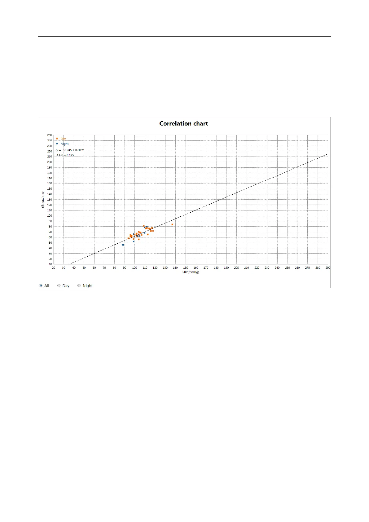
7.4 Correlation
The graph on this tab plots the diastolic on systolic BP values for each measurement captured in
the study. Additionally, this tab lists the calculated AASI (ambulatory arterial stiffness index)
value and linear regression equation. The user can specify which BP values to use in the graph
and calculations by selecting all, day, and night at the bottom of the graph.
7.5 Histogram
This tab shows SYS, DIA, and pulse in histograms. You can choose the time periods of all, day,
and night. X axis represents the blood pressure (mmHg) and pulse rate (bmp). Y axis represents
the frequency (in percentage) for SYS, DIA, and pulse rate.
7.6 Pie Chart
This tab shows pie chart for Overall, Awake, Asleep periods. Illustrate values above the
established high thresholds in red, below the established low thresholds in yellow, and values
within the two thresholds in green.
7.7 Variability
Curves are drawn to show the blood pressure and MAP (mean arterial pressure) variability. The
horizontal axis shows the time of measurement from its start to the end. The vertical axis shows
the true blood pressure on the left and blood pressure variability on the right. Vertical lines shows
the greatest variability and the time it occurs.