Chapter 6 Statistics
Evia HF / HF-T Technical Manual
PAGE 82
The Ap-Vs interval distribution graph in Figure 52 shows the Ap-Vs interval data at different rates. The
As-Vs interval is displayed for various rate ranges, labeled by the average heart rate. The programmed
AV Delay and AV Hysteresis are shown on the graph. These averages are as follows:
• 60 bpm: rate range of 50 - 69 bpm
• 80 bpm: rate range of 70 - 89 bpm
• 100 bpm: rate range of 90 - 109 bpm
• 120 bpm: rate range of 110 - 129 bpm
• 140 bpm: rate range of 130 - 149 bpm
Each bin of data provides the median, minimum, and maximum Ap-Vs interval.
6.6.4 Av-Vs interval distribution curve
This graph provides information related to the amount of Vs response to atrial sensed events. The
information is divided into 5 rate bins and provides the minimum, mean and maximum Ap-Vs intervals
for each rate bin.
The data is also displayed on a graph with the Y axis showing the range of programmable AV Delay
options and the X axis graph showing heart rate.
The number of successful AV hysteresis scans is provided on this graph.
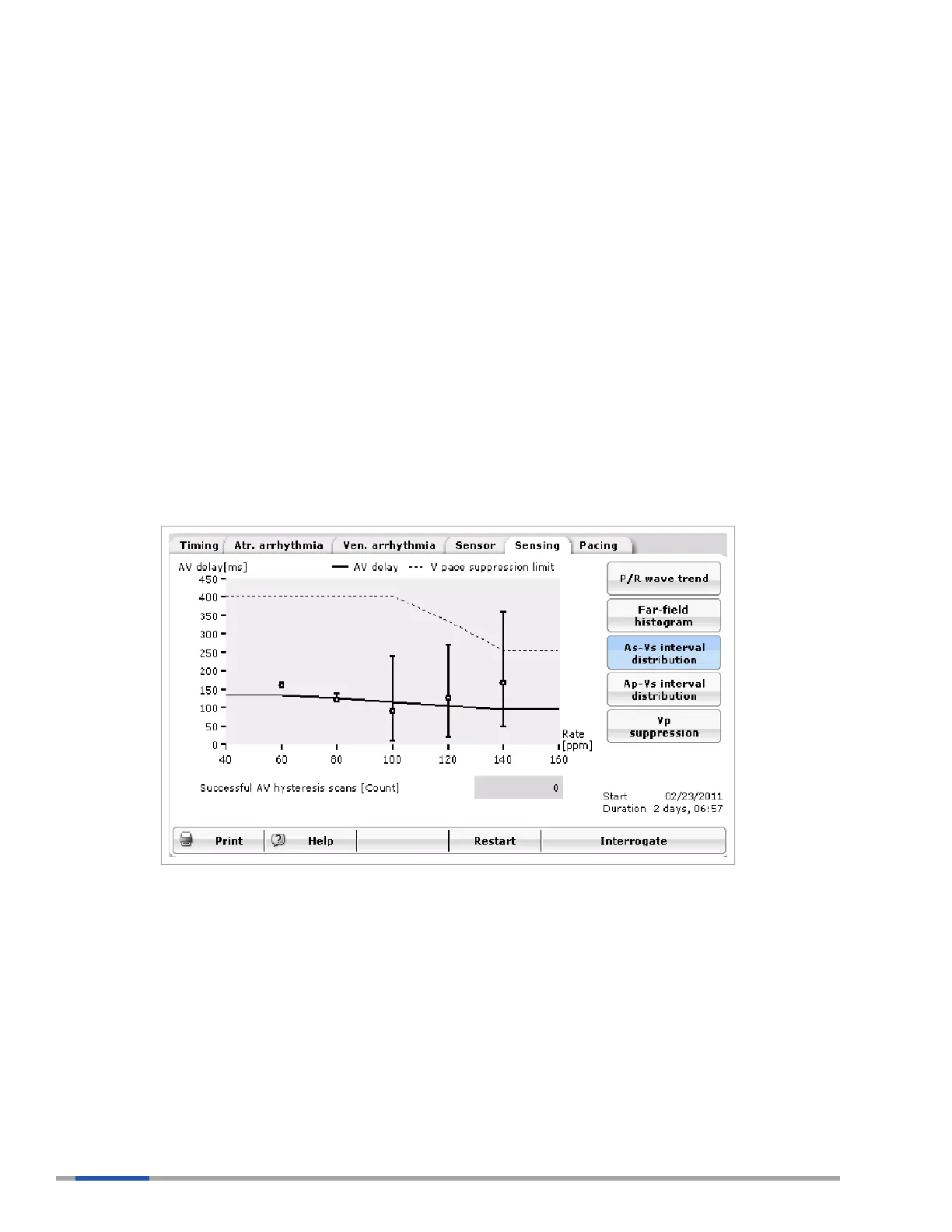
Figure 53: As-Vs Interval Distribution
The As-Vs interval distribution graph in Figure 53 shows the As-Vs interval data at different rates. The
As-Vs interval is displayed for various rate ranges, labeled by the average heart rate. These averages
are as follows:
• 60 bpm: rate range of 50 - 69 bpm
• 80 bpm: rate range of 70 - 89 bpm
• 100 bpm: rate range of 90 - 109 bpm
• 120 bpm: rate range of 110 - 129 bpm
• 140 bpm: rate range of 130 - 149 bpm
Each bin provides the median, minimum, and maximum As-Vs interval.
 Loading...