6-8
2. Calculating and Graphing Single-Variable
Statistical Data
Single-variable data is data with only a single variable. If you are calculating the average height
of the members of a class for example, there is only one variable (height).
Single-variable statistics include distribution and sum. The following types of graphs are
available for single-variable statistics.
You can also use the procedures under “Statistical Graph Parameters” on page 6-1 to make
the settings you want before drawing each graph.
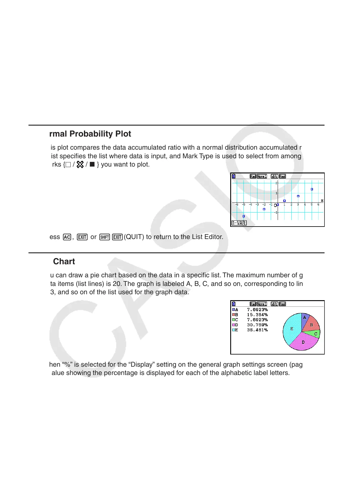
k Normal Probability Plot
This plot compares the data accumulated ratio with a normal distribution accumulated ratio.
XList specifies the list where data is input, and Mark Type is used to select from among the
marks { /
/ } you want to plot.
Press A, J or !J(QUIT) to return to the List Editor.
k Pie Chart
You can draw a pie chart based on the data in a specific list. The maximum number of graph
data items (list lines) is 20. The graph is labeled A, B, C, and so on, corresponding to lines 1,
2, 3, and so on of the list used for the graph data.
When “%” is selected for the “Display” setting on the general graph settings screen (page 6-3),
a value showing the percentage is displayed for each of the alphabetic label letters.