6-15
k Drawing a Regression Graph
Use the following procedure to input paired-variable statistical data, perform a regression
calculation using the data, and then graph the results.
1. From the Main Menu, enter the Statistics mode.
2. Input the data into a list, and plot the scatter diagram.
3. Select the regression type, execute the calculation, and display the regression parameters.
4. Draw the regression graph.
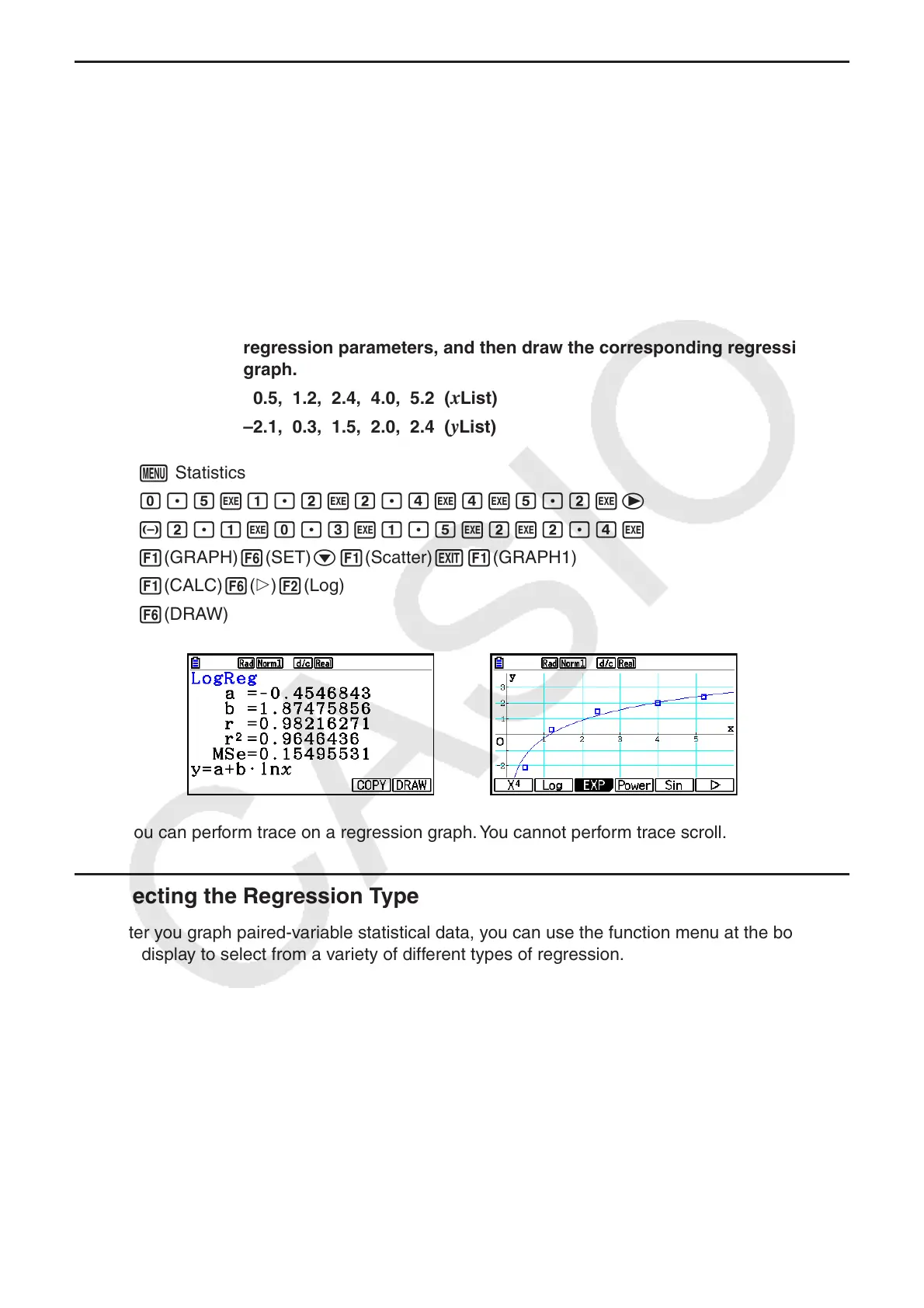
Example Input the two sets of data shown below and plot the data on a scatter
diagram. Next, perform logarithmic regression on the data to display the
regression parameters, and then draw the corresponding regression
graph.
0.5, 1.2, 2.4, 4.0, 5.2 ( x List)
–2.1, 0.3, 1.5, 2.0, 2.4 (
y List)
1 m Statistics
2 a.fwb.cwc.ewewf.cwe
-c.bwa.dwb.fwcwc.ew
1(GRAPH) 6(SET) c1(Scatter) J1(GRAPH1)
3 1(CALC) 6( g) 2(Log)
4 6(DRAW)
• You can perform trace on a regression graph. You cannot perform trace scroll.
k Selecting the Regression Type
After you graph paired-variable statistical data, you can use the function menu at the bottom of
the display to select from a variety of different types of regression.
• { ax + b } / { a + bx } / { Med } / { X
2
} / { X
3
} / { X
4
} / { Log } / { ae
bx
} / { ab
x
} / { Power } / { Sin } / { Logistic } ...
{linear regression ( ax + b form)}/{linear regression ( a + bx form)}/{Med-Med}/{quadratic
regression}/{cubic regression}/{quartic regression}/{logarithmic regression}/{exponential
regression ( ae
bx
form)}/{exponential regression ( ab
x
form)}/{power regression}/
{sinusoidal regression}/{logistic regression} calculation and graphing
• { 2-VAR }... {paired-variable statistical results}