Chapter 13: Spreadsheet Application 242
Regression Graph Operations (Curve Fitting)
After plotting a scatter graph using paired-variable (x, y) data on the spreadsheet, you can draw a regression
graph that approximates the scatter graph and determine the regression formula.
u To plot a scatter graph and then draw its regression graph
1. Enter the paired-variable data into the spreadsheet, and then select the range of cells where it is located.
• For information about how data is treated based on the range of cells that are selected, see “[Graph] -
[Scatter]” (page 241) under “Graph Menu and Graph Examples”.
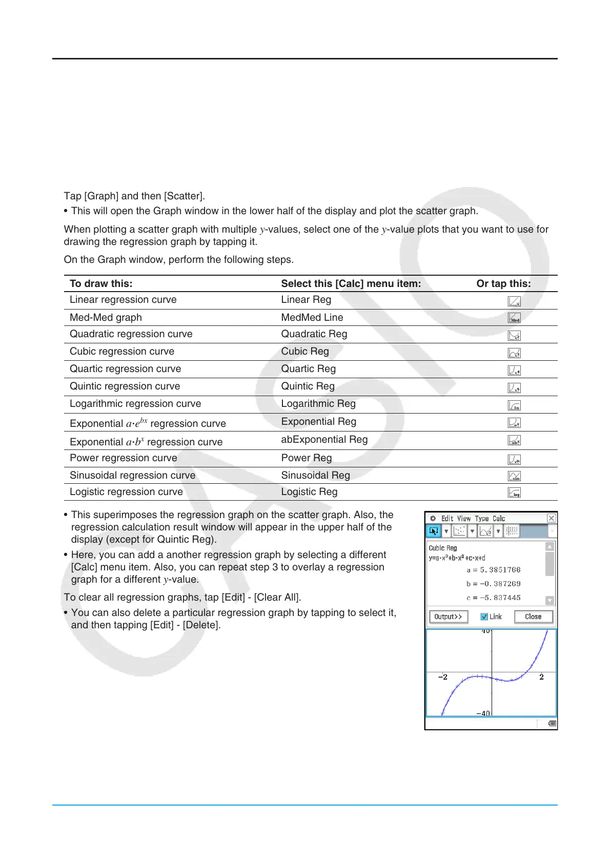
2. Tap [Graph] and then [Scatter].
• This will open the Graph window in the lower half of the display and plot the scatter graph.
3. When plotting a scatter graph with multiple
y-values, select one of the y-value plots that you want to use for
drawing the regression graph by tapping it.
4. On the Graph window, perform the following steps.
To draw this: Select this [Calc] menu item: Or tap this:
Linear regression curve Linear Reg
d
Med-Med graph MedMed Line
2
Quadratic regression curve Quadratic Reg
f
Cubic regression curve Cubic Reg
g
Quartic regression curve Quartic Reg
h
Quintic regression curve Quintic Reg
j
Logarithmic regression curve Logarithmic Reg
l
Exponential
aⴢe
bx
regression curve
Exponential Reg
k
Exponential
aⴢb
x
regression curve
abExponential Reg
4
Power regression curve Power Reg
;
Sinusoidal regression curve Sinusoidal Reg
5
Logistic regression curve Logistic Reg
6
• This superimposes the regression graph on the scatter graph. Also, the
regression calculation result window will appear in the upper half of the
display (except for Quintic Reg).
• Here, you can add a another regression graph by selecting a different
[Calc] menu item. Also, you can repeat step 3 to overlay a regression
graph for a different
y-value.
5. To clear all regression graphs, tap [Edit] - [Clear All].
• You can also delete a particular regression graph by tapping to select it,
and then tapping [Edit] - [Delete].

 Loading...