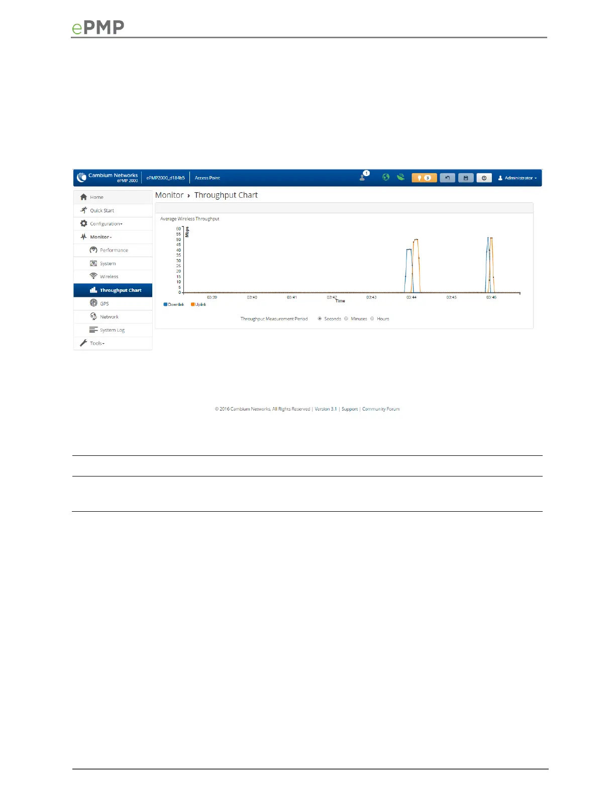
AP Throughput Chart page
Use the Throughput page to reference a line chart visual representation of system throughput over
time. The blue line indicates downlink throughput and the orange line indicates uplink throughput.
The X-axis may be configured to display data over seconds, minutes, or hours, and the Y-axis is
adjusted automatically based on average throughput. Hover over data points to display details.
Figure 47 AP Throughput Chart page
Table 85 AP Throughput Chart page attributes
 Loading...