36
Operating via a web browser within your own network
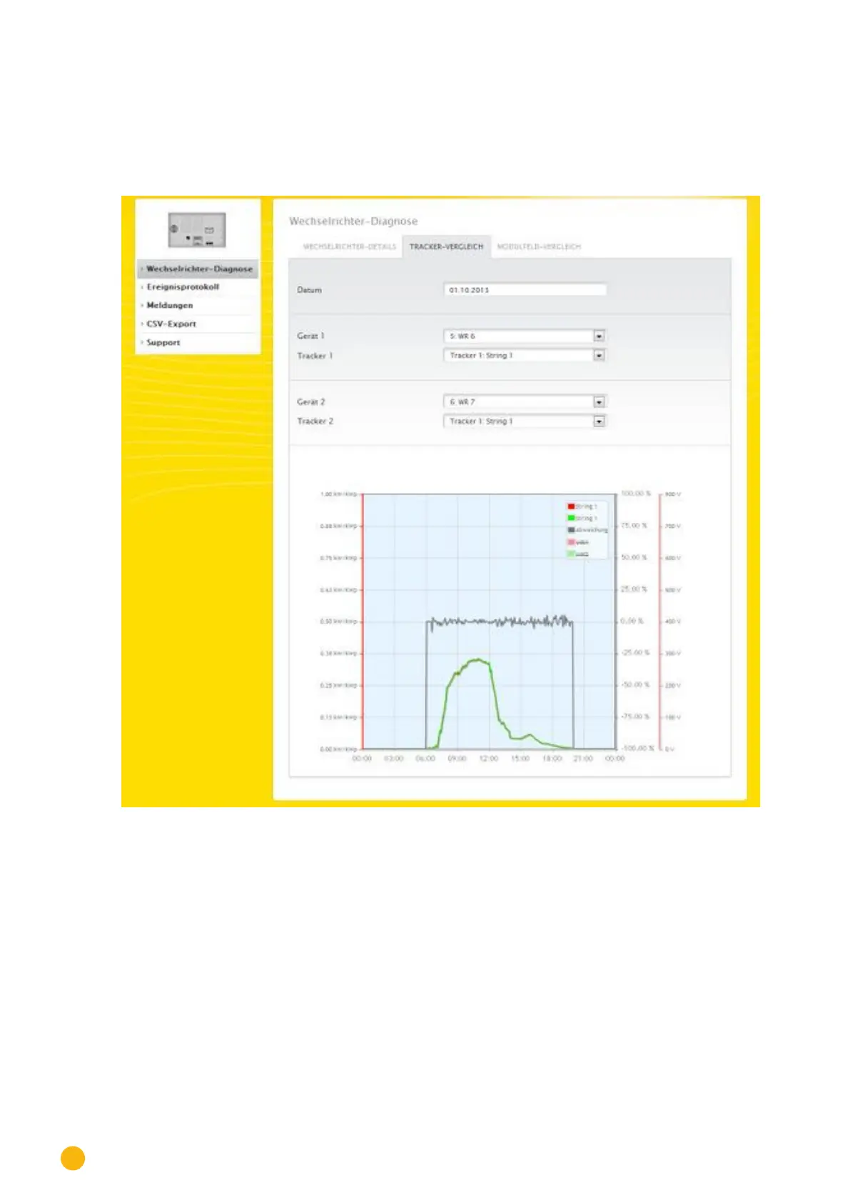
Tracker comparison
To access the Tracker comparison menu, go to Diagnostic | Inverter Diagnostic | Tracker comparison.
Two trackers (either from the same device or two different devices) can be compared on a particular date
by selecting the date, device and tracker.
Fig.: Tracker comparison graph
In the example (see Fig.: Tracker comparison graph), two different inverters have been selected and evalu-
ated. ***the better view has been selected for the DC voltage 1 and 2 values.
The two strings from inverter 6 and 7 are directly compared to each other.
The gray line displays the degree of deviation. The deviation is indicated as a percentage in the right col-
umn and displayed as a positive or negative percentage. In the example, the deviation between the strings
is from about -5% to +5%. The column on the left indicates the kW/kWp output of the tracker.
All of the displayed values can be directly selected and deselected at any time by clicking in the graph key
(upper-right corner of the graph).