Page 33
3.3
Graphs
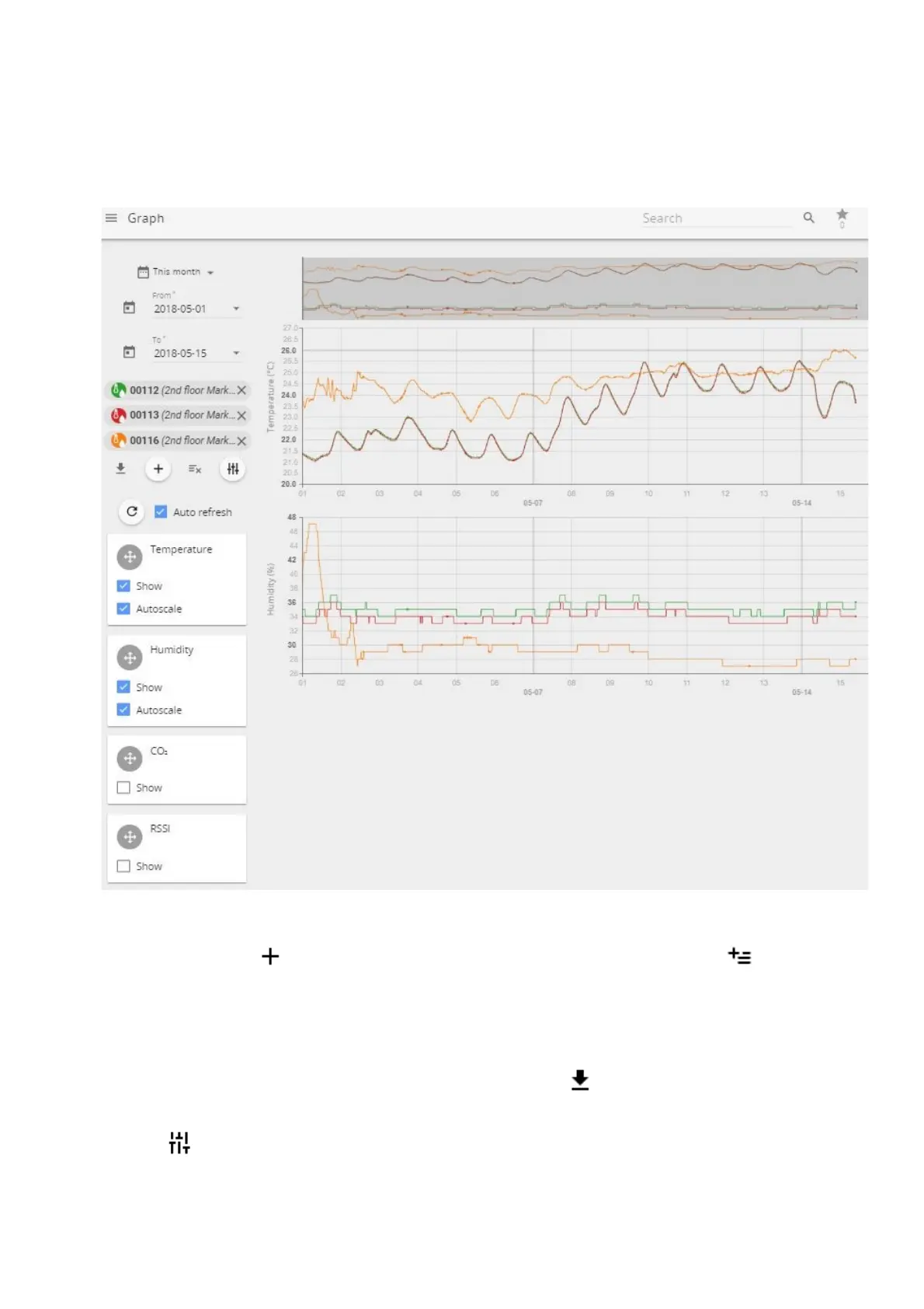
Graphs screen enables user to view, compare and analyze the data from the sensors. The “Graph” page
enables user to look at historical data, patterns, and changes, as well as compare multiple sensor readings
over time to see potential correlations.
(1) By pressing icon add up to 20 sensors at once for analysis one by one or use icon to add
first 20 sensors at once.
(2) Choose which values to graph depending on the attached sensor and receive as much information
as needed.
(3) Set custom period to look for historic data analysis.
(4) Export data to .xlsx, .csv, .png or .svg files by using Download button.
Use Tune button to open a sub-menu allowing user to select or deselect additional parameters to
display on graphics (received signal strength level RSSI, battery level, and others).