67
11.5.1 Handwriting-like output with outline fonts
When trying to achieve output close to that of natural handwriting, an “outlined”
eect is generally not desirable. To mitigate it, pick handwriting-like fonts that
have a thin and consistent stroke width. If a font is available in multiple weights,
you’ll want to pick the lightest (thinnest) one available. This, combined with the
use of a medium or broad nib pen can often make it so that the two sides of the
outline blend together.
Using a broad-point pen, particularly a broad-nibbed fountain pen, is the one of
the most eective ways to make a document look closer to hand written. It is also
helpful to pick a larger font size, closer to that of natural handwriting (perhaps 18
pt) as a starting point. When writing by hand, people tend to write much larger
than typical typed lettering.
If you would like to create a custom handwriting font based on your own hand-
writing, there are free services online (such as http://calligraphr.com) that can
build fonts based on samples that you provide. Even so, note (1) that these are
standard (outline) fonts, and the advice above still applies. In most cases (2),
fonts automatically generated from your handwriting tend to be very crude as
compared to high-quality hand-crafted fonts.
11.5.2 Block and display output
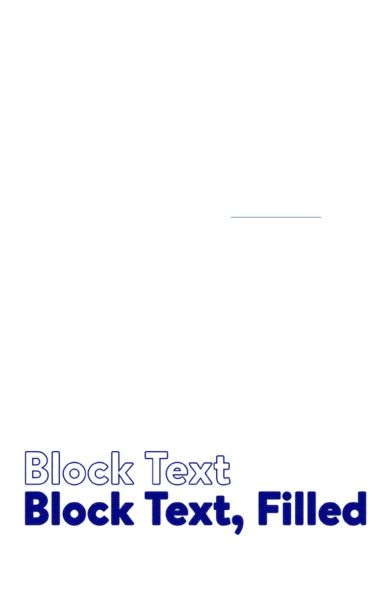
In some cases you may wish to work with text that has large block letters, display
text, or other instances with characters that have a wide cross section. Text like
this will have a very visible outline, which you’ll usually want to fill in with ink.
The best way to do this is to use the Hatch Fill method, as described in §11.11
Filling shapes and text, on page 72. When you apply a hatch fill, it will create a
back-and-forth pattern for the pen to follow, to fill in the shape. While it may be
counterintuitive to fill in text this way, it is much closer to how outline fonts are
intended to be used: The outline is filled in with ink.

 Loading...