Technical Information DFS 700 / 04.2009 8-5
(3) The analysis table is created for the selected reporting period and according to the
speed, weekday, and daytime filtering criteria after pressing the “Apply” button.
(4) The selected data can also be presented as one of eight different graphs by pressing
one of the buttons on the right of the window.
All graphic charts can be printed via the functions of the menu bar. In the print view and
on printing, the logo specified in “Options” is shown.
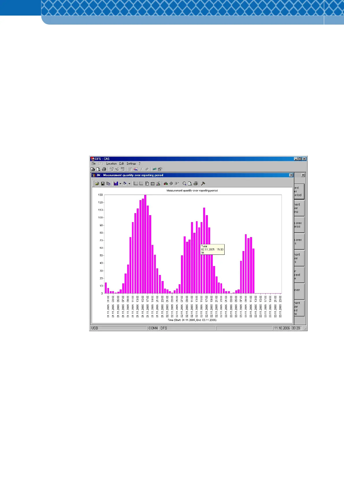
“Measurement quantity over reporting period” button
This chart shows the number of measurements over time for the selected reporting period.
The time interval is defined in the "Data report" window (Figure 8-4).
Figure 8-5 Measurement quantity over reporting period