36 Chapter 2 Working with DaqLab
2.4. Viewing the Data
2.4.1. Display Options
The DaqLab program’s screen consists of three parts: the graph window, table window and Data Map
window. You can display all three parts simultaneously (the default view) or any combination of the
three.
The graph window is the main window by default and is and displayed in the center of the application
window.
In addition to these sections, you have the option to display an on-screen meter for each of the sensors
(refer to page
43).
2.4.2. Graph Display
Click Graph to display or hide the graph. The default graph display is the data set or sets plotted
vs. time, but you can change the X-axis to represent any of the individual data sets (refer to page 39).
The graph usually displays all the data sets of a given recording, but you can use the Data Map to
remove one or more of the sets from the graph (refer to page
43).
In order to keep the graph clear and simple, only two Y-axes are shown on the graph at once. If there
are three curves in the graph, one of the Y-axes is hidden. In order to make this axis visible, select the
corresponding plot with the cursor (refer to bullet
2 below).
You can identify the Y-axis by its color, which matches the plot color.
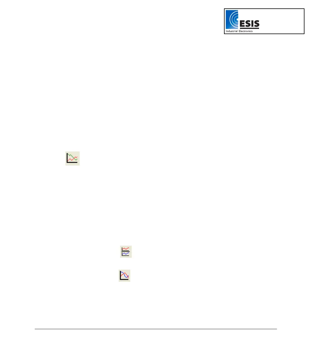
1. Split Graph View
DaqLab enables you to display your data in two separate graphs within the graph window.
a. Click Split graph
on the graph toolbar to split the graph window into two
separate graphs.
b. Click Edit graph
on the graph toolbar to open the Edit graph dialog box.
c. Choose which data sets to display on each of the graphs (or use the Data Map to
do so – refer to page
43).
www.esis.com.au
Ph 02 9481 7420
Fax 02 9481 7267
esis.enq@esis.com.au