70
Operating via a web browser within your own network
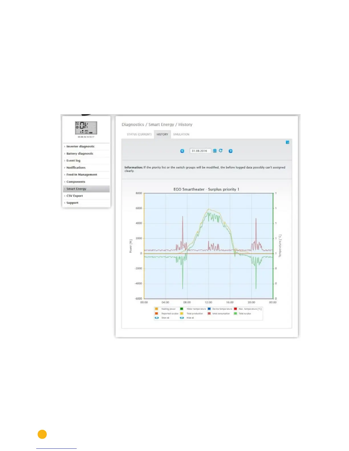
History
Daily graphics, all of the configured control logics and the intelligent appliances are displayed according to
their priority in the
History tab.
All of the relevant data for the particular device is displayed in the graphic.
Each graphic has the curves "Total production," Total consumption" and "Total surplus." This is identical
for every graphic and is part of the overview with the plant-wide values.
(See illustration: "Smart Energy History - Example with EGO Smart Heater - Surplus Priority 1"):
All of the values displayed in the key can be selected and deselected at anytime with a left-click to dis-
play individual values (curve) or to display or hide all values (curves). With a right-click, all of the values
(curves) other than the one selected can be hidden.
Fig.: Smart Energy History - Example of Priority 1
Depending on the connected device and configured control logic the labels may be different and also the
values may vary (e.g.: runtime or switching state).