255
uu
uu
uGraph Color (graph color specification)
•{Blue}/{Orng}/{Grn} ... {blue}/{orange}/{green}
uu
uu
uOutliers (outliers specification)
•{On}/{Off} ... {display}/{do not display} Med-Box outliers
kk
kk
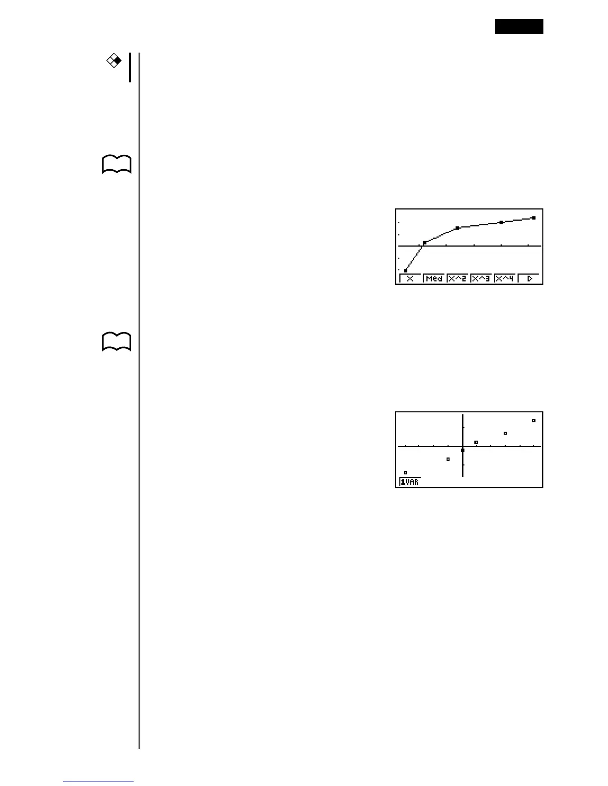
k Drawing an xy Line Graph
P. 254 Paired data items can be used to plot a scatter diagram. A scatter diagram where
(Graph Type) the points are linked is an xy line graph.
(xy)
Press J or !Q to return to the statistical data list.
kk
kk
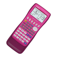
k Drawing a Normal Probability Plot
P. 254 Normal probability plot contrasts the cumulative proportion of variables with the
(Graph Type) cumulative proportion of a normal distribution and plots the result. The expected
(NPP) values of the normal distribution are used as the vertical axis, while the observed
values of the variable being tested are on the horizontal axis.
Press J or !Q to return to the statistical data list.
kk
kk
k Selecting the Regression Type
After you graph paired-variable statistical data, you can use the function menu at
the bottom of the display to select from a variety of different types of regression.
•{X}/{Med}/{X^2}/{X^3}/{X^4}/{Log}/{Exp}/{Pwr}/{Sin}/{Lgst} ... {linear regres-
sion}/{Med-Med}/{quadratic regression}/{cubic regression}/{quartic
regression}/{logarithmic regression}/{exponential regression}/{power
regression}/{sine regression}/{logistic regression} calculation and graphing
•{2VAR} ... {paired-variable statistical results}
Paired-Variable Statistical Calculation Examples 18 - 2
CFX