239
ADOBE PREMIERE 5.0
User Guide
•
Use semibold and bold type weights, which are generally easier to read on television than
regular or light type weights.
•
Use few words in your titles. Long paragraphs of small type are difficult to read on television.
•
When designing a title to be superimposed, use colors that contrast well with the
background video. You can import a sample frame to check a title against its background
(see “Setting up the Title window” on page 234). If the background is complex, consider
adding a shadow (see “Adding a shadow” on page 248) or a semitransparent shape behind
the type (see “Creating graphic objects” on page 244).
Note:
Make sure that the fonts you use in the title file are installed on any other computer where
you plan to open the title file or the project that includes it. Font names are often different between
Windows and Mac OS, even when the fonts are identical. After you complete editing and record
the final cut on videotape or export it to a video file, you no longer need the title fonts.
To create text:
1
Select the type tool ( ).
2
Click to position the top left corner of the text object in the Title window, and type the
text you want.
3
When the type is complete, click outside the text.
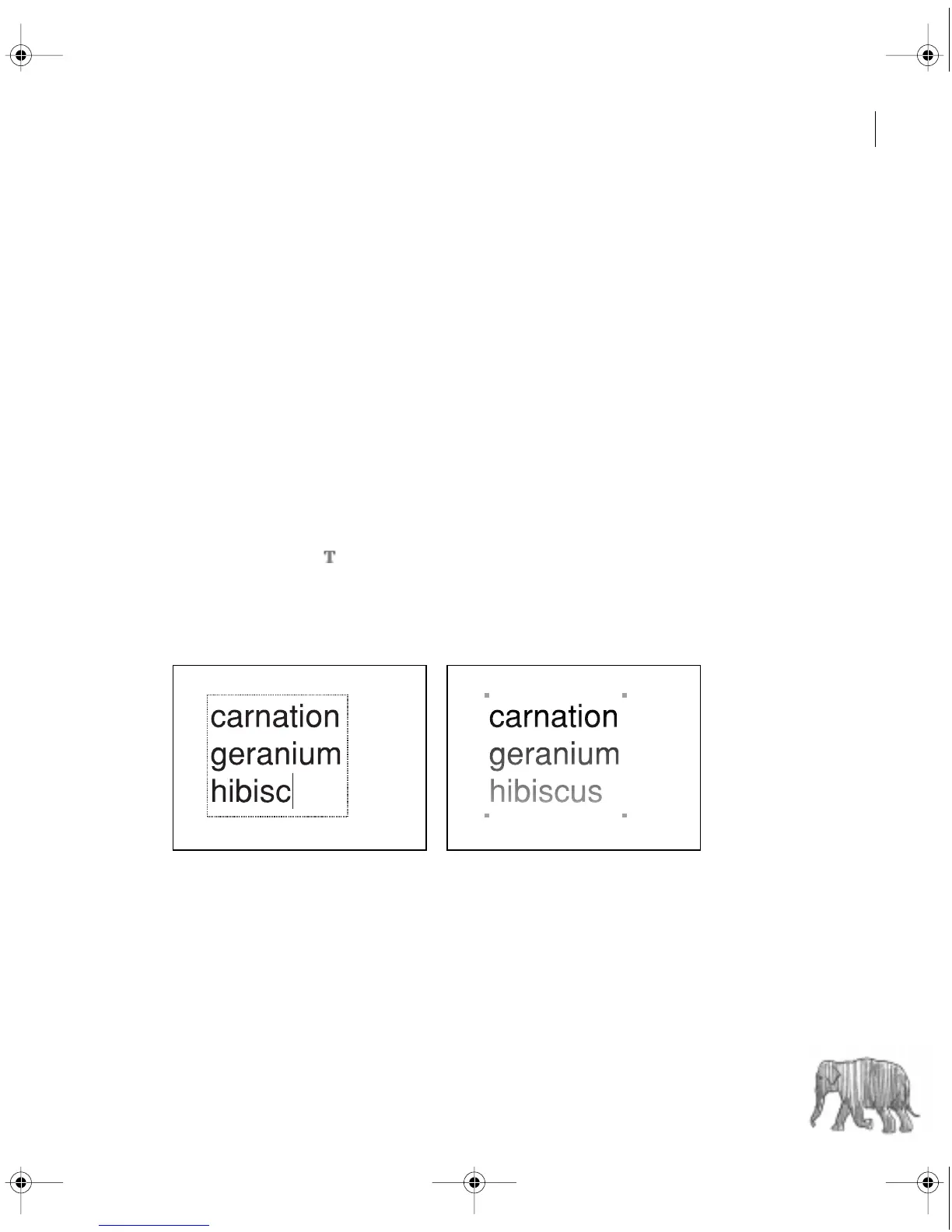
Text while typing (left) and after clicking outside the text (right)
c00.book for PS Page 239 Tuesday, March 31, 1998 1:28 PM