SET-UP & BASIC OPERATION
15
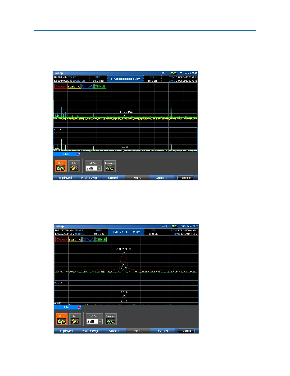
The Math Trace, which should now be displayed, shows a graphical difference of the peak trace
generated in Office B compared to Office A. In the screen shot below, the spectrum was zoomed down
to a 3GHz window to see the areas of the spectrum that contain the greatest differences. In this
example, there are clearly some differences and each area of the spectrum should be closely examined.
Zooming into one of these areas, it is easy to identify that a strong transmitter exists in Office A at
170.2MHz.
 Loading...