VIDEONICS TITLEMAKER 3000 PAGE 51
Bold
The bottom sub-menu provides bold characters, to provide extra empha-
sis. (You can also create an extra-bold effect using the outline styles, as de-
scribed in the hints, below).
HintsonUsingStyles
• Use mixed styles with some caution. As with fonts and sizes, mixing too
many styles can create a haphazard, overly complex look.
• Some combinations will make the text harder to read or less attractive. For
instance, if you use the spacing option to place letters closer together, the
edges of shadows, outlines, or bold letters may be clipped.
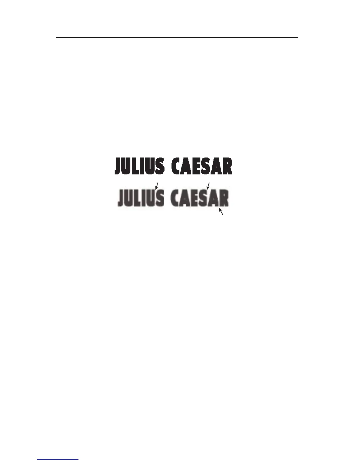
Ifletterspacingissettootight,letterswillbeclipped,asinthebottomsample.
• Bold letterscan make a bold statement. They can also improvereadability
when small titles are placed over a video background.
Hint:For extrabold letters, combinea boldsetting withan outlineinthe same
colorastheletter.Notethatveryboldletterscancausetheopeningsinletterssuch
as“o”and“e”toclose,makingtheresultshardtoread.
• Outlines and shadows are particularly useful for making titles stand out
when the letters and backgrounds are similar in color. They also work well
when titles are placed against a busy video background.
• The color and pattern of the outline or shadow can be set independently of
the letter color — you can have blue letters with a rainbow patterned out-
line, for instance. By making the letter and background the same color, you
can make outlined letters that look hollow. By making the outline and let-
ter the same color, you can make the letters look fatter than usual, in a way
that is different from the effect of bold letters. Other effects are possible —
experiment!
• Choose narrow spacing to squeeze more letters on a line or give a busy,
high-tension look. Use wider spacing to convey a more relaxed tone and
make the titles easier to read. You can widen the spacing even more by
typing one or more spaces between each letter.
VIDEONICS
VIDEONICS
VIDEONICS
VIDEONICS