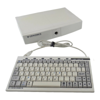
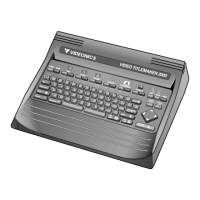
PAGE 54 VIDEONICS TITLEMAKER 3000
no effect on titles that use the color. The titles continue to use the color; it is
simply not displayed in the palette.
There is no way to manually remove a color other than completely reset-
ting the unit. Colors are removed only after 64 user colors have been defined.
Hintson UsingColors
• As with font styles, it’s a good idea to exercise some restraint. It’s tempting
to use lots of wild colors but unless your video production is as wild as the
colors, they may detract from the result.
• Don’t forget black, white, and gray. With the amount of color we see every
day on television, black and white can be a refreshing change. In addition,
black, white, and gray tend to look sharper, especially for small fonts.
• Some colors work better on television than others, especially when they’re
recorded with a VCR. For instance, blue on green doesn’t work well; bright
reds tend to smear; white, black, and gray work well with almost every-
thing.Extremely bright colors maynot look assharp when they’re recorded.
Some background colors are “noisy” (they give a speckled or snowy ap-
pearance) when they’re recorded by most VCRs. Dark colors, especially
dark blue, are likely to be noisy. Solid red also tends to be noisy. Extremely
bright purples and oranges may also be a problem. Medium colors are
usually fine. Light colors, such as sky blue, and black or gray backgrounds
work particularly well.
• Black or white outlines or shadows are often a goodidea: they separate the
letters from the background, making them more legible. If you’re using
small letters, it’s best to use black or white, whichever contrasts the most
with the background.