Section 5. Real-Time Tools
5.2.1.2 Display Components
Display components are the objects that are used to display data. To add a
component to the workspace, click an item on the Component Toolbox and
then click anywhere in the workspace. The component’s Properties window is
automatically displayed when the object is first placed in the work area. The
Properties window is used to set colors, scale values, text, etc., and to assign
the data value to be displayed by the component.
When a display component is linked to a data value, the value
will be automatically updated on the display when data is
collected by LoggerNet on a schedule. If scheduled data
collection is not set up in LoggerNet or the selected data value is
excluded from scheduled collection, the values will not update
and an exclamation point will appear in the upper right corner of
the component. Input locations, ports and flags for mixed-array
dataloggers are collected at the scheduled collection interval or
any time a manual collection is done.
NOTE
After a component’s properties have been set, select OK to enable the changes
and close the Properties window. Once the link to the data value has been
applied, if there is data available from LoggerNet for the component, the value
on the display will update.
To make changes to display component settings, the Properties window can be
opened by double clicking the component. If you make changes to a
component’s properties but then decide to reject those changes, press the
Cancel button to return the properties to the last applied state. If Cancel is
selected when a component is first placed in the work area (and OK has not
been pressed), the display component will be removed from the screen.
Available Components
The following is an overview of the display components available. The online
help has detailed information about each of the components and their
properties.
Pointer returns the cursor to a normal selection tool.
Status Bar depicts the selected data value as a single vertical bar.
Digital depicts the selected data value as a numeric value, text string,
or Boolean.
Alarm provides visual and/or audible notification that a data value
has exceeded a defined limit. An audible alarm can be disabled by
right-clicking the component with your mouse and selecting
Acknowledge Alarm.
Slider depicts the selected data value as a single horizontal bar. The
data value can also be set to a new value by moving the slider.
5-38
 To Next Page
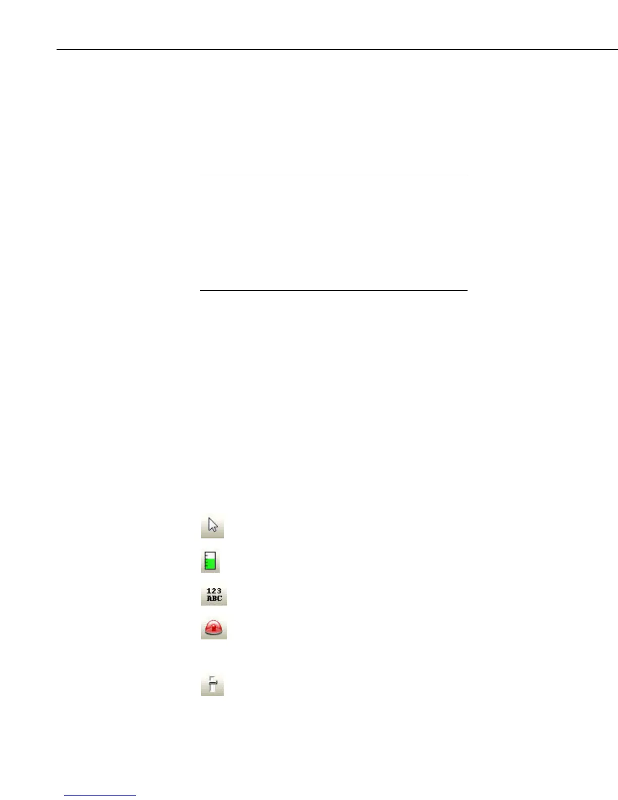 Loading...