297
18-4 Calculating and Graphing Paired-Variable
Statistical Data
Under “Plotting a Scatter Diagram,” we displayed a scatter diagram and then per-
formed a logarithmic regression calculation. Let’s use the same procedure to look at
the six regression functions.
kk
kk
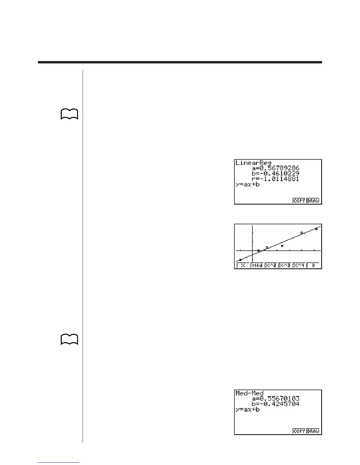
k Linear Regression Graph
Linear regression plots a straight line that passes close to as many data points as
possible, and returns values for the slope and y-intercept (y-coordinate when x = 0)
of the line.
The graphic representation of this relationship is a linear regression graph.
!Q1(GRPH)6(SET)c
1(Scat)
!Q1(GRPH)1(GPH1)
1(X)
6(DRAW)
The following are the meanings of the above parameters.
a ...... Regression coefficient (slope)
b ...... Regression constant term (intercept)
r ...... Correlation coefficient
kk
kk
k Med-Med Graph
When it is suspected that there are a number of extreme values, a Med-Med graph
can be used in place of the least squares method. This is also a type of linear regres-
sion, but it minimizes the effects of extreme values. It is especially useful in produc-
ing highly reliable linear regression from data that includes irregular fluctuations,
such as seasonal surveys.
2(Med)
123456
P.289
(Graph Type)
(Scatter)
(GPH1)
(X)
P.289
123456
 Loading...