3 Graphical User Interface
3.1 Controls
The PowerMaster
®
human interface uses familiar Windows style controls. The behavior of many
of the controls have been enhanced to eliminate the need for a pointing device such as a mouse.
Text Boxes
Text boxes are entered by or . When the cursor enters the control, any data in the text
box is highlighted. Typing at this point will replace the information currently in the text box. If the
text box is colored yellow, it is a required field. If the text box is colored gray, the field cannot be
edited. This is typically data from the master database which is presented for reference only.
Drop-down boxes
Once the user tabs ( or ) into a dropdown list box, they can change the selection in one
of two ways:
1. Press or to move to the previous or next selection in the list, press to
accept and continue.
2. Press to cause the selection list to drop down, then press or to make a
selection, press again or to accept the selection. Note: focus remains on the
drop down box. The user must press to go to the next field.
In drop-down boxes, the user can also enter text as long as an item is not presently selected.
Required Fields
These tagged fields (yellow background) require entry before continuing to the next screen. If the
user continues with no entry, a pop-up window states, “These fields are required: x,x,x” “Enter to
continue” The cursor returns to the first required field if not entered.
Check Boxes
When the user tabs ( or ) into a check box, the label highlights in orange. The user can
then press or key to change the state of the check box.
Rev 1.5 31

 To Next Page
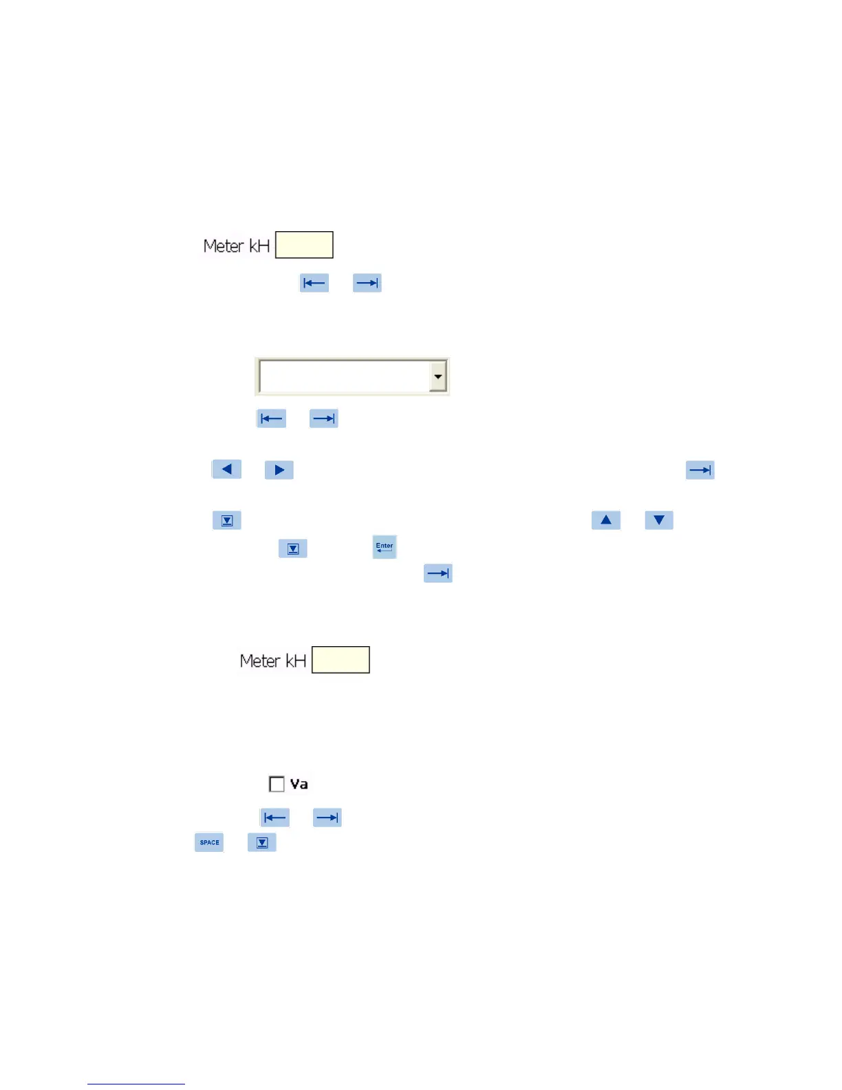 Loading...