Analyzing Runs
75 G-TECH / Pro Competition User Guide, Release 3.1 75
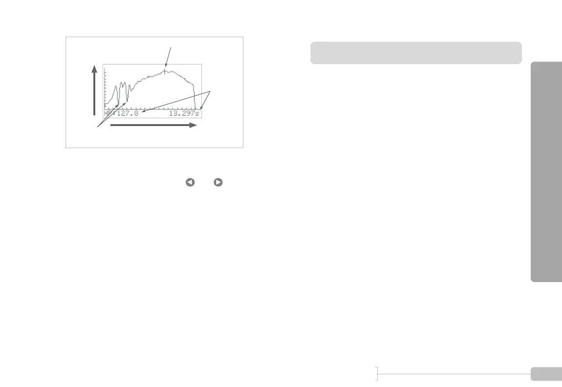
Figure 34: Graph of horsepower vs time
• As you move the cursor with and , the horse-
power and time values are adjusted to match the cursor.
• Note the “dips” in measured horsepower on the 1-2
shift and the 2-3 shift
• This was a “3rd gear horsepower run” because the user
spent the most time in 3rd gear
• Each tic mark on the horizontal axis represents 1 second
• Each tic mark on the vertical axis represents 10 HP
RPM vs time
The “RPM vs time” menu entry provides you with a graph of
vehicle RPMs throughout the run.
This is one of the most-used G-tech graphs.
By looking at the data in this graph, you can find out:
• how much time you spent in each gear
• what time each shift occurred
• how long each shift lasted
• the RPM range in each gear
• the RPMs (and implied gear) for each milestone
• whether you experienced wheelspin (look for a sudden
sharp rise in RPMs)
• whether you should stay in a particular gear longer for
better results (for example, maybe you’re shifting into
4th gear just before the 1/4 mile mark and would actu-
ally benefit from remaining in 3rd gear through the finish
line)
Cursor (current position)
Horsepower
Time
Change as
cursor
moves
Shifts