WaveRIDER 91
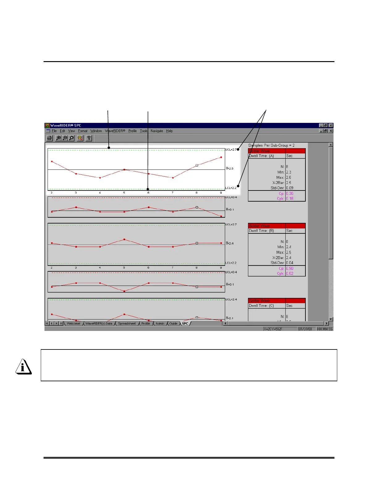
4.7.2 X-Bar Chart
The X-Bar Chart is the graphical chart produced from samples of a selected parameter.
The chart uses a rolling average of 2 through 6 sample points specified by the user. The
X-bar is the average of the data samples and the UCL and LCL are calculated using a
formula based on the Range data.
Figure 4- 57: X-Bar Chart
The calculation numbers vary depending on the data in the Spreadsheet
worksheet. Using the filter function or the hide command allows the user to
select the specific data runs to include on the SPC chart.
CALCULATIONS
NUMBER
X-BAR CHART
UCL & LCL

 Loading...